Resources - Table of Contents:
- Learn more about climate change
- Tools & site-search
- Glossaries
- References
- Sea-level
- Satellites & sea-level measurement
- Sea ice, thermal expansion & sea-level
- North Carolina & sea-level
- Floods & sea-level
- Climate Reports & Debates
- Climate cycles
- Temperatures
- Greenhouse gases: carbon dioxide, methane, etc.
- Petitions etc.
- Energy
- Other resources
- See also: Blogs etc (climate blogs and other climate-related sites)
Resources
- Learn more about Climate Change, a concise list of resources:
http://tinyurl.com/learnmore4 - Tools:
- The Sealevel.info Data page has tools for sea-level analysis and graphing.
- New Zealand physicist Bryan Ward has created a very useful website for New Zealand sea level information, called SeaLevel.nz. ↑
- WebPlotDigitizer is an excellent free tool for digitizing graphs.
- Wood for Trees: Paul Clark's very useful web site for analysis and interactive graphing of climate temperature data. ↑
- Dr. Kevin Cowtan of U. of York has a temperature graphing tool which is similar to WoodForTrees. In May, 2015 he also released a tool for graphing GHCN temperatures (unfortunately with the in-your-face offensive name, “DENIAL101x temperature tool”), and usage instructions on the SkS blog. ↑
- NOAA NCDC “Climate at a Glance” tool for graphing climate data for any U.S. State: http://www.ncdc.noaa.gov/cag/ (not to be confused with the Heartland resource by the same name) ↑
- There's a lot of climate data available from the KNMI Climate Explorer. ↑
- Norwegian environmentalist Jan Kjetil Andersen has created an environmental analysis site, csens.org, which includes some sea-level tools. ↑
- I don't know who runs climatedata.info, but I wish they were still keeping the data there up-to-date. ↑
- WolframAlpha is a mathematical tool, which is a bit pricey. But they also have a free web page where you can enter a system of equations for numeric or analytical solution, and it works quite well. Here's an example. ↑
- My Extreme Precision Binomial Probability Calculator goes to considerable effort to avoid overflow and underflow problems, so it works correctly when most others fail.
- Useful programming environments/tools include Anaconda Python (and related tools), Strawberry Perl, R, and a spreadsheet tool like Microsoft Excel or LibreOffice Calc.
- Glossaries:
- Glossary - ordered for readability. ↑
- Glossary - ordered alphabetically
- The "Dictionary of the Climate Debate" (DCD) is the most comprehensive glossary I've found of climate-related terminology.
- WUWT also has a glossary, and a collection of book reviews.
- NOAA's Tides and Currents Glossary is a very comprehensive glossary of the terminology used on their tidesandcurrents.noaa.gov web site.
- The AMS has a huge glossary of meteorology & climate terminology.
- The BBC has a short climate change glossary, and another UK company has a useful glossary of oceanography terminology.
- The EPA has a glossary of climate change terms (alt) (here or here). They also have a six-page “GHG Inventory Protocol glossary,” and a Kids' Climate Glossary.
- So does the IPCC (in five languages),
and they have a glossary
and a long list of the acronyms
used in AR5, and (new in 2021) the 42 page long AR6
“Annex XII Glossary.”
(old).” - So does the Fraser Institute's AR4 Summary for Policymakers Report, starting on page 60.
- Glaciologist James Aber has a glossary of terms used in glaciology, on his Emporia State University site.
- The U.S. Climate Change Science Program's unfortunate 2007 “State of the Carbon Cycle Report” includes a useful glossary and list of acronyms & abbreviations.
- References:
- IRI/LDEO Climate Data Library has climate data from (and links to) many sources, though not much about sea-level, and many of the links are stale. ↑
- The WattsUpWithThat.com ("WUWT") blog has an excellent collection of links to climate-related resources. ↑
- The RealClimate.org ("RC") blog has a useful (though biased) collection of links to climate data sources. ↑
- Common conversion factors for water, air, ice and sea-level,
will help you answer questions like these:
Q: “if a cubic mile of ice from the Greenland Ice Sheet melts and runs into the ocean, by how much will it raise worldwide average sea-level?” (A: 0.0106 mm)
Q: “if a gigatonne of CO2 is added to the atmosphere, by how much will it affect average atmospheric CO2 levels?” (A: 0.124 ppmv) ↑ - Statistics: confidence intervals explained, and how to calculate composite standard deviations. ↑
- Books: I am grateful to Peter F. Gill and Roger Helmer, MEP for this list of recommended books about climatology, from generally skeptical perspectives. ↑
- Sea-level:
- Do
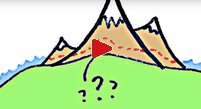 you think you know exactly what “sea-level” means?
If so, it might be because you haven't thought about it very much. The MinutePhysics guy,
Henry Reich, explains it nicely in this 3½ minute YouTube video:
![[VID]](video_icon_20x22.png) What is Sea Level?.
What is Sea Level?.
(It's more complex than you probably think.) ↑ - The NOAA sea-level data portal has a useful collection of links to several sea-level data collections. (NASA also has a new sea-level portal, but theirs is an “educational” page, devoted mostly to politicized climate propaganda, rather than real data.)
- The
 most important thing that everyone should know about climate change and sea-level is that
there's been no significant sustained
acceleration
(increase) in the rate of sea-level rise
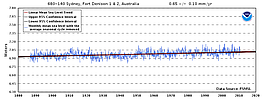
in over 85 years. All around the world, the best sea-level measurements all show the same thing:
an almost perfectly linear trend. Sea-level is rising no faster now, with CO2 at
0.040% of the atmosphere, than it was when CO2 was less than 0.031%
 of the
atmosphere, in the early 1930s, during the Great Depression.
of the
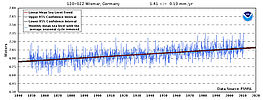
atmosphere, in the early 1930s, during the Great Depression.There are about sixty good-quality, century-long records of sea-level around the world. A couple of them extend back more than 200 years. Due to differences in local factors (primarily vertical land motion), the rates of sea-level change vary greatly between those locations. Some are recording falling sea-level, and more are recording rising sea-level; the average is slightly rising. But they all show the 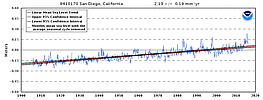 same thing w/r/t acceleration: none of them have measured
a statistically significant increase in the rate of sea-level rise in over 85 years. At most
locations it's been more than a century since the rate of sea-level rise measurably increased.
same thing w/r/t acceleration: none of them have measured
a statistically significant increase in the rate of sea-level rise in over 85 years. At most
locations it's been more than a century since the rate of sea-level rise measurably increased.Since atmospheric GHG (mainly CO2) levels have been increasing substantially for about seventy years, mostly because of fossil fuel use, the lack of acceleration in sea-level rise over that period means that anthropogenic GHG emissions have not detectably affected sea-level. The sealevel.info data page has measurement data in spreadsheets, with links to graphs. ↑ - Sea-level
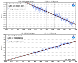 is not rising everywhere. The measured rate of coastal sea-level change ranges from
-17.59 mm/year at Skagway, Alaska
(where sea-level is
falling due to PGR), to
+9.39 mm/year at Kushiro, Japan
 (where the land is subsiding,
perhaps due to coal mining).
(where the land is subsiding,
perhaps due to coal mining).The average rate of sea-level change, calculated from measurements by the world's best long-term coastal tide gauges, is just under +1.5 mm/year (about six inches of sea-level rise per century). - NOAA has many sites and programs, of varying quality, including:
- National
 National Centers for Environmental Information (NCEI), a/k/a
National Climatic Data Center (NCDC): https://www.ncdc.noaa.gov/
National Centers for Environmental Information (NCEI), a/k/a
National Climatic Data Center (NCDC): https://www.ncdc.noaa.gov/NCEI/NCDC has many useful climate-related datasets (old), but it outrages me that they actively work to prevent archiving of climate data, e.g., via abuse of robots.txt. (If I were President Trump I'd fire somebody for that so fast there'd be skid marks in the parking lot where his butt hit the pavement, and the skid marks would be a long way from the door!) - CO-OPS (“Tides and Currents”): http://tidesandcurrents.noaa.gov/
(Competent, trustworthy sea-level data and analysis.) - Climate Program Office: http://cpo.noaa.gov/
(Mostly lousy, but their news feed is marginally useful.) - National Ocean Service: http://oceanservice.noaa.gov/
(Not trustworthy! Run by unscrupulous activists. Should be called the Climate Propaganda Ministry.) ↑
- National
- Zervas, C. (2009), NOAA Technical Report NOS CO-OPS 053, Sea Level Variations of the United States, 1854 - 2006, is a great resource with in-depth information about determination of sea-level trends from tide gauge measurement records.
- PSMSL: http://www.psmsl.org/ (Permanent Service for Mean
Sea Level) global repository for long-term sea-level data.
PSMSL now uses a remarkably obscure approach for sea-level trend analysis. The old (circa 2015) trends (which they calculated by simple linear regression) are here, and the new results are here. For some long-record sites, they've also improved their handling of differences between Mean Sea Level (MSL) and Mean Tide Level (MTL) measurements. Perhaps surprisingly, the results of their new trend calculations are very close to the sealevel.info linear regression trend calculations. (Note: The files have Unix-style (LF) line delimiters. To “fix” them for Windows, by changing the line delimiters to CR+LF, you may use my “fixtext” program. Example command: fixtext trends.txt ) ↑ - GLOSS (Global Sea Level Observing System): http://www.gloss-sealevel.org/. “The backbone of the global tide gauge network is the GLOSS Core Network, a global set of 290 tide gauge stations that provide optimal sampling of the global ocean for a range of oceanographic applications.”
- GLOSS 1997 Implementation Plan Annex IV GLOSS-LTT station list
- GOSIC: https://www.ncdc.noaa.gov/gosic (or old version, or older version).
- The Sea Level Station Monitoring Facility of the Intergovernmental Oceanographic Commission (IOC-UNESCO) provides information about the operational status of global and regional networks of real time sea level stations, and links to many national data authorities. ↑
- University of Hawaii Sea Level Center: http://uhslc.soest.hawaii.edu/ (and old site).
- JASL: http://ilikai.soest.hawaii.edu/uhslc/jasl.html (and data). ↑
- List of old-style PSMSL coast/country codes and station names (or here, or here).
- List of NOAA tide stations, "stations with verified data" & "complete index."
- List of PSMSL Authorities and country/station codes.
- NOAA's list of
45129 U.S. tide stations for which NOAA did long term trend analysis (or new page). - NOAA's list of PSMSL (non-U.S.) tide gauges for which NOAA did long term trend analysis (and an old version which also included the 45 U.S. stations).
- NOAA's GOSIC Sea Level Station List (November 2013), and related documents (or old version).
- A .csv data file received on 2012-07-20 from PSMSL, with the mapping between NOAA's station numbers and PSMSL's.
- Post-Glacial Rebound (PGR) has many subtle effects, and even
affects the rotation of the Earth.
Prof. Richard Peltier has calculated model-derived Glacial
Isostatic Adjustment data files, including GIA estimates for all PSMSL tide gauges, which are available
for download from his
datasets page.
(I also saved 2011 versions of his data files here. But note that the last 3 columns in the .txt files represent 100 years ago ["0.1 kBP"], present, and 100 years hence, respectively, rather than the 250 year intervals used in Prof. Peltier's latest datasets; and also that these versions are affected by an error which was corrected in 2012.) Dr. Peltier also gives a GIA estimate for the effect on sea-level of the hypothesized ongoing sinking and broadening of the ocean basins, as the result of the loading from meltwater during the last deglaciation: 0.30 mm/year. He doesn't give an uncertainty estimate, but Aviso assumes ±0.05 mm/yr at 90% CL (per private communication). Tamisiea, 2011 gives a broader range: 0.15 to 0.5 mm/year. Note: Many climate scientists add that adjustment [usually Peltier's 0.30 mm/yr estimate] to measured rates of sea-level change, and report the sum as the rate of “sea-level rise,” which is a mistake. That sum is not actually sea-level rise. It is an estimate of what sea-level rise would be if the ocean floor were not sinking. (Frederikse et al 2017 calls the sum “barystatic sea level rise,” which he distinguishes from real sea-level rise, which he calls “geocentric sea level rise.”) Calculating the sum is useful when accounting for sources of sea-level change, but it is not the rate of sea-level rise, and it should not be reported as “sea-level rise.” There are several other groups of researchers doing similar work. This paper reviews and compares the leading GIA models, with emphasis on their handling of Antarctica. ↑ - Tom Moriarty's collection of sea-level data (and related blog article).
ClimateWiki.org has a good overview of the subject of sea-level rise.- http://tinyurl.com/rahmstuff has information about the so-called "Rahmstorf Method" of predicting accelerated sea-level rise.
- Meltwater from the Greenland ice sheet is a significant contributor to sea-level rise,
but the Greenland Ice Sheet is losing mass very, very slowly.
It would take 90-150 centuries to lose it all, at the current
rate, and that rate apparently has not increased substantially in the last ninety years. (If it had increased then
sea-level rise would have accelerated, which has not happened, at least not significantly.)
The Danish Meteorological Institute (DMI) tracks ice trends there, and DMI & “Polar Portal” produce reports each “glaciological year” (September-August), e.g.: 2012-13, 2013-14, 2014-15, 2015-16, 2016-17 (preliminary & final), 2017-18, 2018-19, 2019-20, 2020-21, and current year. Greenland has a net loss of ice most years, but not every year. In fact, in both the 2016-17 and 2017-18 glaciological years it apparently gained a small amount of ice. It is known that during the MWP (circa 850-1300 AD) Greenland was significantly warmer than it currently is, apparently without causing notable global sea-level rise. One of the ways we know that Greenland was warmer then is that the Norsemen who colonized Greenland's coasts grew barley[2][3] there, and it is too cold to grow barley there now, even with modern, quick-maturing cultivars. During the HCO it was apparently warmer yet. ↑
- Do
- Antarctica's ice sheets are very stable. Ice accumulation and loss are very, very close to
being in exact balance there. Even the
northernmost Antarctic Peninsula
(contrary to widespread misinformation) isn't warming significantly.
Doran et al 2002
found that, even though the Earth as a whole experienced 0.06°C/decade of warming during the 20th century, there was
“a net cooling on the Antarctic continent between 1966 and 2000, particularly during summer and
autumn.” Olivia et al 2016
found that most of the Antarctic Peninsula has been cooling since 1999, and which they believe is the cause of a
“slow-down of glacier recession” in the northern Antarctic Peninsula.
Based on GRACE, Shepherd 2012 concluded that Antarctica's ice mass change since 1992 has averaged -71 ±83 Gt/yr, which means they couldn't tell whether it's gaining or losing ice mass. Based on ICESat, Zwally 2012 found that Antarctica is gaining ice mass: +27 to +59 Gt/yr (averaged over five years), or +70 to +170 Gt/yr (averaged over 19 years). Based on CryoSat, McMillan (2014) found Antarctica is losing 79 to 241 Gt/yr of ice, though that's based on only 3 years of data. A NASA study in Dec. 2015 (Zwally et al 2015) reported that Antarctica is gaining 82 ±25 Gt of ice per year. The range from those various studies, with error bars, is from +170 Gt/yr to -241 Gt/yr, which is equivalent to just -0.47 to +0.67 mm/yr sea-level change. That's equivalent to less than 3 inches of sea-level change per century. The latest and most comprehensive NASA study is Zwally, et al (2021). It reports an Antarctic ice mass trend of -12 ±64 Gt/yr, which is a fancy way of saying “approximately zero.” The melting is mostly “basal melting” of the the undersides of floating ice shelves. (Ice shelves are made up of ice which has flowed downhill from the ice sheet & glaciers, and is now floating on the ocean. When that floating ice is still attached to the land it's called ice shelves, and when it breaks off and floats away it's called icebergs. With respect to its effect on sea-level, it doesn't matter which it is. Its displacement and its effect on sea-level are unaffected by whether the ice is attached to the land or detached, and also unaffected by whether or not it melts.) The studies of Antarctic and Greenland ice mass trends depend on model-derived estimates of GIA: the motion of the land beneath the ice sheets. Unfortunately, there's no way to measure it, so there's no way to know how close to reality those estimates are. However, rock & magma are nearly three times as dense as ice, so errors in GIA estimates distort GRACE-based ice mass balance numbers nearly three times as much as they distort altimetry-based ice mass studies. Steve McIntyre wrote an exceptionally comprehensive and insightful article about these various studies of Antarctic ice on his ClimateAudit blog, and Jonathan Bamber also wrote an informative article about it on the RealClimate blog, both in late 2015. The bottom line is that, although we don't know whether Antarctica is gaining or losing ice, we do know the rate, either way, is so tiny that it's having a negligible effect on sea-level. ↑ - Climate alarmists like to hype fears of climate change by talking about how much sea-level rise we'll get
if Antarctica's ice all melts.
It's useful for scaring children, but it doesn't work on people who know that Antarctica averages more than forty degrees below
zero, so a few degrees of warming obviously cannot melt it. That's a problem for promoters of climate alarmism.
“Marine ice cliff instability” has been proposed as a solution to that problem: a hypothetical mechanism for Antarctic ice to cause drastic sea-level rise, despite it being much too cold to melt. Here's an early (2005) review paper about it by Richard Alley. The general idea is that if floating ice shelves disintegrate, then grounded ice sheets upstream would end in unstable ice cliffs, which would rapidly collapse into the ocean and float away. Dr. Judith Curry's whitepaper on sea-level (p. 42), treats the idea with more seriousness than I think it merits, but even she wonders, “Are these scenarios... plausible? Or even possible?” I'm confident that the answer to that question is “no,” and a 2019 study supports my confidence (see also NSF article). ↑ - The effect of meltwater from grounded ice on sea-level is more complex than you might expect.
If grounded ice melts and the meltwater finds its way into the ocean, of course it raises average global sea-level. But it also slightly changes the mass distribution on the Earth's surface, which changes local gravity fields, which changes the distribution of water in the oceans, and has uneven regional effects on sea-level. Suppose, for example, that a substantial amount of ice were to melt from the Greenland Ice Sheet, and run into the ocean. The gravitational attraction by which the ice sheet attracts the surrounding ocean would be reduced, which would cause the ocean to recede in the vicinity of Greenland. It has been calculated by people who presumably know what they're talking about that in the vicinity of Greenland (and apparently as far away as parts of Europe) this effect would exceed the rise in sea-level due to water added to the ocean, so that sea-level at Greenland and the surrounding region would actually fall, rather than rise, as the ice sheet melted. But that water which flows away from Greenland would also add to sea-level elsewhere, causing sea-level elsewhere around the globe to rise a bit faster than you would expect from a simple calculation from the amount of water added to the ocean. This effect is probably only significant for Greenland, because only Greenland is losing enough ice from one place to much affect the Earth's gravity field, so I call it the “Greenland Gravity Effect.” Most of the tide gauges which it significantly affects are in northern Europe, so Prof. Jerry Mitrovica calls it the “European Problem.” Here's a short video  from Boston University's Maureen Raymo, explaining it.
Additionally, if a substantial amount of ice were to melt from the Greenland Ice Sheet, the weight of the Greenland ice sheet on the ground beneath would be reduced, so the ground would then slowly rebound upward ("post-glacial rebound"), which would cause the sea-level at Greenland to continue to fall (or to rise at a reduced rate) for thousands of years into the future. That rebound (PGR) would, in turn, also change the gravity field, and thus the water distribution in the oceans, which would presumably reduce the rate of local sea-level fall near Greenland. Harvard's Jerry Mitrovica explains it in greater detail here (after unfortunately spending 13½ minutes bludgeoning straw men, and just before erroneously conflating tide gauge and satellite data). Unfortunately, the video's owners are censoring commentary on YouTube. They “fake-approved” but hid ("ghosted") my critique. ↑ - That lack of substantial acceleration in sea-level rise is despite the fact that there are two anthropogenic factors, unrelated to climate, which should have been expected to cause a slight acceleration in sea-level rise: reservoir impoundment (which peaked with the filling of the reservoir behind the Aswan High Dam in the late 1960s and early 1970s, and has slowed since then), and groundwater extraction (which has accelerated). Both of those should have caused a very slight increase in the rate of sea-level rise over the last 40 years. The fact that the rate of sea-level rise has nevertheless failed to increase significantly suggests that the aggregate melt-water contribution to sea-level rise might be slowing slightly, rather than increasing. ↑
- Note: for a better-formatted, standalone version of this section, see: https://sealevel.info/satellite_altimetry.html
- Aviso's satellite altimetry sea level data, notes, and graph (and new version, old version, and criticism of their dramatic revisions to the ENVISAT data [alt] [2]). ↑
- Univ. of Colorado Sea Level Research Group,
Aviso
and NOAA all have groups working on
sea-level measurement by satellite altimetry.
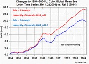 Note: Even though the satellite measurements show no acceleration in sea-level rise,
changes in how the satellite data is processed and adjusted have substantially
increased
the amount of sea-level rise which U. Colorado reports.
There are many different factors
[2]
which can affect reported trends, but which are difficult to ascertain with certainty, and are subject to substantial and
often mysterious corrections.
Note: Even though the satellite measurements show no acceleration in sea-level rise,
changes in how the satellite data is processed and adjusted have substantially
increased
the amount of sea-level rise which U. Colorado reports.
There are many different factors
[2]
which can affect reported trends, but which are difficult to ascertain with certainty, and are subject to substantial and
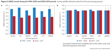
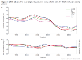
often mysterious corrections.To see how malleable the satellite altimetry data is, consider this well-known paper, which sought to explain away an apparent declining trend in the rate of sea-level rise measured by satellite altimetry. They managed to massage the data until that embarrassing decline had almost entirely disappeared. Here are two pairs of graphs from the paper, each showing the “before” and “after” versions, showing how they “corrected” the work of 5 (five!!) different satellite altimetry analysis groups, to almost completely eliminate the decline, which all five groups had measured:
This article & comments at WUWT have a good discussion of how adjustments have increased rate of sea-level rise reportedly “measured” by satellite altimetry. (h/t Steve Case [here & here]) Another example illustrating the malleability of the satellite altimetry data is a widely-hyped 2018 paper by U. Colorado's Dr. Steve Nerem et al, which claimed to have discovered “acceleration” in the satellite altimetry measurement record of sea-level — by reducing the rate of measured sea-level rise in 20 year-old Topex-Poseidon data, thereby making more recent measurements appear to have accelerated, by comparison. ↑
- From Frank Lansner and Jo Nova comes an enlightening but disturbing article about suspicious adjustments to sea-level measurement data from satellite altimetry. ↑
- Unfortunately,
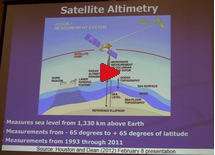 measurement of sea-level by satellite altimetry is fundamentally unreliable. Physicist Willie Soon explains the
problems starting at 17:37 in this very informative
hour-long lecture. ↑
 - To address some of these problems, in 2011 NASA proposed
(and re-proposed
in 2014
/ 2015)
a new satellite mission called the Geodetic Reference Antenna in SPace (GRASP). The proposal is
discussed here,
and its implications for measuring sea-level are
discussed here.
The Europeans are apparently considering a similar mission
(E-GRASP). ↑ - DORIS (Doppler Orbitography and Radiopositioning Integrated by Satellite) is a Doppler satellite tracking system for determining satellite locations. ↑
- NOAA's National Geodetic Survey CORS program (Continuously Operating Reference Stations) provides satellite-based 3D positional data, measuring subsidence, uplift, and lateral movement of the Earth's surface at more than 1,900 locations. Here's a map showing the station locations: http://www.ngs.noaa.gov/CORS_Map/. ↑
- SONEL is a French organization; they have GPS station resources, vertical land motion (VLM) estimates, and tide-gauge data. ↑
- For a standalone version of this section (more suitable for pasting into Quora, etc.), see http://sealevel.info/satellite_altimetry.html
- When the density
 of water decreases, due to either warming or freezing, its volume increases. That's called “thermal
expansion” or “thermosteric expansion.” This photograph shows an example of
locally elevated sea-level
due to thermosteric expansion.
of water decreases, due to either warming or freezing, its volume increases. That's called “thermal
expansion” or “thermosteric expansion.” This photograph shows an example of
locally elevated sea-level
due to thermosteric expansion.Contrary to a widespread misconception, sea-level rise due to thermal expansion does not necessarily affect sea-level at the shorelines, nor anywhere else, except locally, where the expansion occurs. Changes in the density of the upper layer of the deep ocean produce sea-level change which is strictly local, because gravity balances mass, not volume. It can affect sea-level measurements taken via satellite altimetry, but it does not affect the coasts, and should not be included in sea-level estimates used for coastal planning. ↑ - Floating sea ice does not directly affect coastal sea levels,
so the much-ballyhooed
Arctic
ice extent is unimportant w/r/t sea-level. But if you're curious about sea ice trends,
you can see them graphed
on the U. Illinois Cryosphere Today site.
Longer-term (pre-satellite) estimates for the Arctic can be found in
Connolly, Connolly & Soon, 2017.
Sea ice extent in each hemisphere varies drastically by season, but the global total is always between 14 and 24 million square kilometers, with little long-term trend (though climate alarmists often predict an imminent dramatic decline [or 2]). 1/22/2017 UPDATE: An earlier version of this page reported that there was “hardly any significant trend” in global sea ice extent. However, 2016 saw a sudden decline in reported global sea ice extent, which occurred coincidentally with the demise of the DMSP F17 & F19 satellites that were measuring it. Because of that timing, I'm skeptical that the decline is real, but “hardly any significant trend” is not a proper description for 2016's reported sea ice extent numbers. Globally, sea-ice can only indirectly affect sea-level, by affecting snowfall. When sea ice coverage goes down, evaporation from the ocean increases, which causes increased “lake/ocean-effect” snow deposition on ice sheets and glaciers, increasing grounded ice mass, and decreasing sea-level. ↑ - The details of how sea ice extent is counted can have a large effect on the reported trends. (h/t Ron Clutz) ↑
- Denmark's
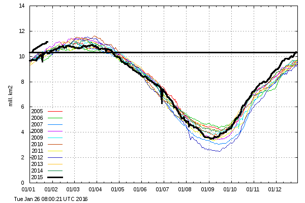 Meteorologiske Institut (DMI)
hashad a graph comparing the current year to the preceding ten years' "30%+" Arctic sea ice extent, with coastal zones masked out, by graphing each year in a different color on the same horizontal timescale. They also have a graph comparing the current year to the preceding four years' "15%+" Arctic sea ice extent (or go here and then click "Large version of graph" link). In both graphs, the current (partial) year is graphed with a heavier black line.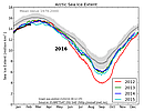 As of January 2016, depending on which graph you chose, you
 cancould "prove" that Arctic sea ice extent is either the highest (in the "30%+" graph) it's been in the last eleven years, or the nearly the lowest (in the "15%+" graph) it's been in the last five years.Update: On 2016-02-18 DMI discontinued the "30%+" version, which had showed high recent Arctic ice extents. The differing trends were apparently due to a technical problem with the "30%+" version. ↑ - The University of Illinois
hashad a graph of global sea ice extent starting in 1979; click on it for the full-sized, updated version:
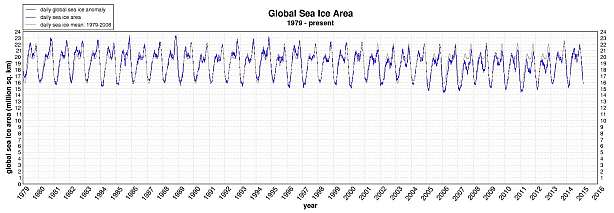
Note: due to the demise of the DMSP F17 & F19 satellites, U. Illinois sea ice extent data since March, 2016 is degraded. ↑ - The NSIDC also has graphs of
Arctic &
Southern Ocean sea ice extent,
and the MASIE (Multisensor Analyzed Sea Ice Extent)
product (though currently only for the Arctic).
As of May, 2016, the NSIDC has switched to using the DMSP F18 satellite for their sea ice data (though only 10 of 24 SSMIS channels are still functional on that satellite), due to the failures of the F19 & F17 satellites in February & April, respectively. ↑ - Unfortunately, graphs of sea ice which start with 1979, like the U. Illinois sea ice graph, are
somewhat misleading, because 1979 was a peak year for Arctic sea ice extent
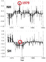 (though not Southern Ocean sea ice extent). The 1990 IPCC
FAR reported on p.224 that:
(though not Southern Ocean sea ice extent). The 1990 IPCC
FAR reported on p.224 that:“...satellite observations have been used to map sea-ice extent routinely since the early 1970s. ... Since about 1976 the areal extent of sea-ice in the Northern Hemisphere has varied about a constant climatological level but in 1972-1975 sea-ice extent was significantly less. In the Southern Hemisphere since about 1981, sea-ice extent has also varied about a constant level. Between 1973 and 1980 there were periods of several years when Southern Hemisphere sea-ice extent was either appreciably more than or less than that typical in the 1980s.” The units in that FAR graph are millions of km², but they used an ice concentration threshold of 10%, rather than the 15% which is more common today (which makes the FAR ice extent numbers a bit larger). The 1979 peak appears to represent a growth of somewhere between 0.5 and 1.0 million km² over five years. For comparison, since the 1980s it appears that Arctic ice extent maximums have declined about 1 million km², and minimums by about twice that. So it appears that at least half of the current over-hyped decline in Arctic sea ice is due to the anomalous 1979 starting point. Recent research suggests that the late 1970s growth in Arctic sea ice had probably been ongoing since the early 1950s, and that the increase in Arctic sea ice over the third quarter of the 20th century was as large as the decrease in sea ice over the subsequent thirty years. The IPCC's 1995 SAR and 2001 TAR also mentioned the early (pre-1979) satellite measurements (SAR WGI Fig.3.8 p.150 & TAR WGI Fig.2.14 p.125), but more recent IPCC Assessment Reports do not. 1979 was the beginning of sea ice measurements by the Nimbus 7 satellite. NASA has apparently lost the earlier sea ice measurements, from Nimbus 5, Nimbus 6, and Seasat 1.The most important pre-1979 data are from Nimbus 5, the first satellite with a scanning microwave radiometer which could view ice through clouds. It collected data from December 11, 1972 through May 16, 1977.
Correction (2016-01-10): This NASA page says, "This [Nimbus 5 sea ice] data set is available from the National Snow and Ice Data Center, (NSIDC)." On the NCIDC site, we find the Nimbus Data Rescue Project, which has recovered some previously lost data from Nimbus 1, 2 & 3, some of it very recently. That's great news! For Nimbus 5, NSIDC has sea-ice concentration data through December 1976 available for download, and associated documentation. I don't know what happened to the early 1977 data, and I don't know why the last two IPCC Assessment Reports have not utilized the 1973-1977 data. ↑ - Like sea ice, ice shelves are floating ice, so their growth or decline has no significant direct effect on sea-level. However, it is thought that ice shelves can affect the rate at which upstream glaciers flow toward the sea, and thus have an indirect effect on sea-level. However, although ice shelf calving events get an enormous amount of media attention, their effect on sea-level is believed to be small.[2] ↑
- NC-20.com is an organization representing the twenty coastal North Carolina counties. The sealevel.info webmaster, Dave Burton, is one of several NC-20 Science Advisors. ↑
- The 2010-2012 North Carolina sea-level fight:
In 2010 the NC DCM's Coastal Resources Commission (old) (CRC)
Science Panel on Coastal Hazards (old) produced a severely-flawed
"Assessment Report" (alt)
projecting wildly accelerated sea-level rise, to justify potentially ruinous regulatory
changes for NC's coastal communities. That Report prompted critiques from physicist John Droz
(part 1 and part 2),
sealevel.info webmaster Dave Burton (here), and others.
Burton also discussed the Report in this
lecture at the John Locke Foundation.
In April 2012, the CRC Science Panel issued an Addendum (alt) to their 2010 Report, defending the Report's conclusions even while abandoning its key claim that the rate of sea-level rise has accelerated. Six of the Report's authors also issued a separate defense of the Report, which doubled down on its errors. The NC General Assembly then enacted a new law, HB-819, by lopsided margins, requiring further study of the issue before imposing regulations. HB-819 was harshly criticized by Climate Movement activists like Duke University's Bill Chameides, who claimed that it was a bill to "mandate how much sea level will rise," and said that it legislates "how much sea level rise… is lawfully allowable." Those false accusations prompted this rebuttal from sealevel.info webmaster Burton. Physicist John Droz has compiled a very useful Timeline/History of the kerfuffle over sea-level rise in North Carolina. The CRC Science Panel's final 2015 Report is vastly improved from the 2010 version, but still has some problems. ↑ - NCDENR: http://portal.ncdenr.org/web/cm/sea-level-rise (or old version)
- www.ncsealevelrise.com: NC Sea Level Rise Impact Study; the webmaster here, Dave Burton, was on their Advisory Committee.
- nccoos.org: North Carolina Coastal Ocean Observing System.
- ncfloodmaps.com: North Carolina Floodplain Mapping System.
- The State Climate Office of North Carolina is hosted by NCSU, in Raleigh. ↑
- December 2, 2016 — North Carolina's top environmental official, DEQ Secretary Don van der Vaart, has written two excellent letters about the role and policies of the EPA, which are worth your time to read. The first, which was also signed by the top environmental officials of four other States, was to President-elect Donald Trump. The second was to EPA Administrator Gina McCarthy. ↑
- The Biggert-Waters Flood Insurance Act of 2012 mandates that FEMA create new Flood Insurance Rate Maps (FIRMs) which incorporate climate science and sea-level rise projections.
- FEMA National Flood Insurance Program: Flood Hazard Mapping.
- FEMA's National Flood Insurance Program Community Status Book, including State-by-State lists of FEMA's six-digit "Community Numbers" (a/k/a "Community Identification Number," "Community ID," or "CID").
- FEMA's Technical Mapping Advisory Council (TMAC) Reports.
- IPCC.ch is the web site of the U.N. Intergovernmental
Panel on Climate Change ("IPCC"), the embattled flagship Climate Movement institution, which has produced
five major Assessment Reports
 on climate change, to date, and a number of other reports, such as their 2001
Special Report on Emissions Scenarios. (The sealevel.info webmaster, Dave Burton, was an IPCC
AR5 WGI Expert Reviewer.)
on climate change, to date, and a number of other reports, such as their 2001
Special Report on Emissions Scenarios. (The sealevel.info webmaster, Dave Burton, was an IPCC
AR5 WGI Expert Reviewer.)Unfortunately, the IPCC has very serious credibility issues. Investigative journalist Donna Laframboise explains the problems in this enlightening lecture:
![[VID]](video_icon_20x22.png) Why almost nothing you know about the IPCC is true.
Why almost nothing you know about the IPCC is true.(It's 31 minutes long, but, to her credit, Ms. Laframboise speaks  so clearly that she's perfectly
understandable if you play the video at 1.5x or even 2x speed,
which will reduce the playing time to as little as 15½ minutes.)
so clearly that she's perfectly
understandable if you play the video at 1.5x or even 2x speed,
which will reduce the playing time to as little as 15½ minutes.)Ms. Laframboise has also written a highly-acclaimed book. ↑ - Environmentalist David Siegel has compiled an excellent list of very high quality climate reports
which go against the common narrative that humans are changing the Earth's climate for the worse. His blog is ClimateCurious.com.
He has been deplatformed on both LinkedIn.com and Medium.com for reporting science. When Medium.com started, he was in the second group of writers invited to participate. He wrote there for over a decade. But in October, 2023, Medium deleted his account for failure to comply with their thought police. They sent him a message saying that his account was suspended because his writing about climate science was a violation of their policies. He replied, saying that he publishes and write about peer-reviewed research from reputable journals. They replied that the ban is permanent. I recommend subscribing to his mailing list, which you can do by scrolling to the bottom of any page on his ClimateCurious.com blog. I particularly enjoyed his 2015 essay entitled, What I Learned About Climate Change: The Science is not Settled.↑ - Free ebook:
Why
Scientists Disagree About Global Warming: The NIPCC Report on Scientific Consensus, by Craig D. Idso, Robert M. Carter,
S. Fred Singer. © 2016, Heartland Institute (second edition).
(Or first
edition.)
See also ClimateChangeReconsidered.org (formerly nipccreport.org), which is the web site of the Nongovernmental International Panel on Climate Change (NIPCC). They've produced a series of climate reports by teams of distinguished scientists, in response to the IPCC's reports. ↑ - A team of ten distinguished scientists, led by Prof. Ross McKitrick, wrote the Independent Summary for Policymakers of the IPCC Fourth Assessment Report in 2007. ↑
- The 2014 National Climate Assessment Report (NCA3)
is a detailed statement of the Obama Administration's position on climate issues (though the Administration was not
as unified as it appeared — President Obama's former Undersecretary for Science, physicist
Steven
Koonin, has since admitted to being somewhat of a skeptic[2]).
The 2017 “Climate Science Special Report,” (NCA4 CSSR)
though released during the Trump Administration, was also produced by people chosen during the Obama
Administration.
Both Reports present lopsided, politicized distortions of the scientific evidence, from just one side of the debate. But they tried to make it appear otherwise. I attended the NCA4 SE Regional Engagement Workshop, where they issued a call for volunteers to serve as NCA4 expert reviewers. I emailed them, and volunteered. (Note that I had previously served as an IPCC AR5 WGI Expert Reviewer.) I was then informed that it was too late to volunteer. In fact, it had already been too late at the time of the workshop, when they issued the call for volunteers. The call for volunteers was a sham, which created the appearance of openness. The whole process amounted to a pretty sleazy trick: they picked all the people involved during the Obama Administration, and packed the teams with people at one end of the spectrum of opinion. Then they released the Report during the Trump Administration, accompanied by a blitz of propaganda falsely claiming that the alarmist Report was from the Trump Administration's “own scientists.” Googling for that phrase finds hundreds of hits. ↑ - The Republican Staff of the U.S. Senate Committee on Environment & Public Works has
released a series of 39(!) (and counting) excellent white
papers and other documents, including the definitive report on the UEA CRU's leaked Climategate emails:
'Consensus' Exposed: The CRU Controversy (Feb. 23, 2010) (or here).
It is 73 pages long, plus 10 pages of footnotes with hyperlinks.
Three years later they released a 23-page follow-up report, Critical Thinking on Climate Change (July 18, 2013), and a year after that they released another 92-page report, The Chain of Environmental Command: How a Club of Billionaires and Their Foundations Control the Environmental Movement and Obama's EPA (July 30, 2014). ↑ - Testing the Waters: A Report on Sea Levels, to the Australian House of Representatives Joint Standing Committee on Treaties, by John L. Daly, August 19, 2000. ↑
- 1974 CIA Report on climate change
(or here)
entitled, A Study of Climatological Research as it Pertains to Intelligence Problems.
The dreaded climate threat then was global cooling, rather than warming. Here's an excerpt, from the Summary: “The western world's leading climatologists have confirmed recent reports of a detrimental global climatic change… during 50 of the last 60 years the Earth has, on the average, enjoyed the best agricultural climate since the eleventh century… The world is returning to the type of climate which has existed over the last 400 years. That is, the abnormal climate of agricultural-optimum is being replaced by a normal climate of the neo-boreal era. The climate change began in 1960…”
The grim climate to which we were thought to be returning was the Little Ice Age. "Boreal" means cold:boreal. adj. Relating to or characteristic of the climatic zone south of the Arctic, especially the cold temperate region dominated by taiga and forests of birch, poplar, and conifers... ↑
- In 1975, the U.S. National Academy of Sciences published a 270-page Climate Report (or here, or text only) entitled, Understanding Climate Change: A Program for Action. ↑
- National Geographic, Nov. 1976: What's Happening to Our Climate? ↑
- University of Oslo climatologist Ole Humlum's Climate4You.com site has a remarkably comprehensive collection of climate information. He's also produced annual climate reports for 2009, 2010, 2011, 2012, 2013, 2014, 2015, 2016, 2017, 2018, 2019 & 2020. ↑
- The Arctic Council's Arctic Climate Impact Assessment (ACIA) Report (2005), and AMAP Synthesis Report (2004). ↑
- On December 7, 2009, a day which will live in infamy, the U.S. EPA issued its
controversial Greenhouse Gas
Endangerment Finding
in support of the Obama Administration's regulation of CO2 and other
greenhouse gas emissions under the Clean Air Act.
The Endangerment Finding is legally flawed and scientifically indefensible;
here are three reports about it: ↑
- In March 2009 U.S. EPA economist & physicist Alan Carlin prepared a scathing internal report criticizing the EPA's reliance on outdated IPCC conclusions for its proposed Greenhouse Gas Endangerment Finding. The EPA quashed Carlin's report and issued the Endangerment Finding anyhow, but Carlin was eventually vindicated. ↑
- The 2016 Tropical Hot Spot Research Report, by James P. Wallace III, John R. Christy & Joseph S. D'Aleo, reports the results of a 2016 investigation into the alleged existence of a so-called “tropical tropospheric hot spot,” as predicted by GCMs, and used as justification for the CO2 Endangerment Finding. The “Tropical Hot Spot Research” website hosts pdfs of the Executive Summary and Full Report. ↑
- The 2017 “Abridged Research Report,” On the Validity of NOAA, NASA and Hadley CRU Global Average Surface Temperature Data & The Validity of EPA's CO2 Endangerment Finding, by Drs. James P. Wallace III, Joseph S. D'Aleo & Craig D. Idso. See also the discussion at WUWT. ↑
- Hansen et al (1981), Climate Impact of Increasing Atmospheric Carbon Dioxide, Science, 28 August 1981. ↑
- The EPA's old web site
used to have an on-line copy of
a 1984 book[2]
entitled,
Greenhouse effect and sea level rise: a challenge for this generation,
edited by Michael C. Barth & James G. Titus, with a foreword by William D. Ruckelshaus:
- Cover; Copyright page;
partial Contents: v, vii
(I'd be grateful for copies of missing pages vi & xiii, if you have them. -DAB) - Forward: ix, x; partial Preface: xi, xii
- Chapter 1: An Overview of the Causes and Effects of Sea Level Rise, by James G. Titus and Michael C. Barth (42 pgs)
- Chapter 2: Climate Sensitivity to Increasing Greenhouse Gases, by James E. Hansen, Andrew A. Lacis, David H. Rind, and Gary L. Russell (16 pgs)
- Chapter 3: Estimates of Future Sea Level Rise, by John S. Hoffman (20 pgs)
- Chapter 4: The Physical Impact of Sea Level Rise in the Area of Charleston, South Carolina, by Timothy W. Kana, Jacqueline Michel, Miles O. Hayes, and John R. Jensen (35 pgs)
- Chapter 5: Coastal Geomorphic Responses to Sea Level Rise: Galveston Bay, Texas, by Stephen P. Leatherman (24 pgs)
- Chapter 6: Control of Erosion, Inundation, and Salinity Intrusion Caused by Sea Level Rise, by Robert M. Sorensen, Richard N. Weisman, and Gerard P. Lennon (27 pgs)
- Chapter 7: Economic Analysis of Sea Level Rise: Methods and Results, by Michael J. Gibbs (29 pgs)
- Chapter 8: Planning for Sea Level Rise before and after a Coastal Disaster, by James G. Titus (12 pgs)
- Chapter 9: Implications of Sea Level Rise for Hazardous Waste Sites in Coastal Floodplains, by Timothy J. Flynn, Stuart G. Walesh, James G. Titus, and Michael C. Barth (20 pgs)
- Chapter 10: Independent Reviews (13 pgs)
- Index: 317, 318, 319, 320, 321, 322; Contributors: 323, 324, 325
- Back cover. ↑
- Cover; Copyright page;
partial Contents: v, vii
- The Grantham Institute in London is a well-heeled climate alarmist think tank. (An earlier version of this page called them “one of the more sober climate alarmist institutions.” Unfortunately, that praise was mistaken.[1][2]) ↑
- CFACT's 2016 State of the Climate Report is from a skeptical perspective. ↑
- From Joanne Nova, the Skeptics Handbook I and the Skeptics Handbook II. ↑
- In 1998 Dr. James Hansen debated Dr. Patrick Michaels. ↑
- In 2016–2017 TheBestSchools.org hosted an 18-month-long, in-depth, online debate between three
leading figures in the argument over climate change:
Prof. David Karoly and Mr. Glenn Tamblyn
represented the “alarmist” side.
Prof. Will Happer represented the “skeptical” side.
Here are the links:
- FCD Series introduction: The Most Rigorous Debate on Climate Change & Global Warming
- Introduction: Karoly-Happer Dialogue on Global Warming
- Alarmist side: Karoly interview
- Skeptical side: Happer interview (or this updated version)
- Alarmist side: Karoly major statement
- Skeptical side: Happer major statement
- After the Major Statements, Dr. Karoly became discouraged and dropped out, so TheBestSchools.org ran a contest and solicited responses from climate alarmists, to find someone to replace Dr. Karoly in the conversation. They picked what they judged to be the most compelling response, by Mr. Glenn Tamblyn, to represent the alarmist side of the argument.
- Alarmist side: Detailed Response by Tamblyn (who replaced Karoly)
- Skeptical side: Detailed Response by Happer
- Alarmist side: Final Reply by Tamblyn
- Skeptical side: Final Reply by Happer ↑
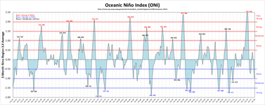 Golden Gate Weather Services has a nice graph of ENSO
(El Niño Southern Oscillation) history, showing the El Niño (warm) and La Niña (cool) years and intensities,
based on this NWS data.
(Click the graph for a full-sized version.) The very strong 2015-2016 El Niño
closely resembles
the very strong 1997-98 El Niño, except that the 2015-2016 El Niño was not followed by a strong
La Niña. For much, much more detail,
 see
NOAA's weekly ENSO status report,
Klaus Wolter's Multivariate ENSO Index (MEI) page,
this reconstruction of the Oceanic Niño Index back to 1871,
and the Australian Government Bureau
of Meteorology's ENSO Wrap-Up page and
NINO 3.4 SST Index
graph.
see
NOAA's weekly ENSO status report,
Klaus Wolter's Multivariate ENSO Index (MEI) page,
this reconstruction of the Oceanic Niño Index back to 1871,
and the Australian Government Bureau
of Meteorology's ENSO Wrap-Up page and
NINO 3.4 SST Index
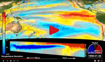
graph.Australia's NCI (National Computational Infrastructure) Visualisation Team has produced a highly detailed, beautiful animation of the 1997-98 El Niño, and WUWT has a discussion about it. ENSO 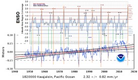 does not affect long-term sea-level trends, and does not affect properly-calculated globally
averaged sea-level. But because it affects Pacific trade winds,
it is positively correlated with sea-level in the eastern Pacific,
and inversely correlated with
sea-level at some Pacific tide gauges, like Kwajalein, in the Marshall Islands (western Pacific), as discussed
here
and here,
which affects the GBR and other coral reefs. ↑
does not affect long-term sea-level trends, and does not affect properly-calculated globally
averaged sea-level. But because it affects Pacific trade winds,
it is positively correlated with sea-level in the eastern Pacific,
and inversely correlated with
sea-level at some Pacific tide gauges, like Kwajalein, in the Marshall Islands (western Pacific), as discussed
here
and here,
which affects the GBR and other coral reefs. ↑- Another
important but poorly understood climate cycle
is the Atlantic Multidecadal Oscillation
(AMO),
which cycles over approximately 60-70 years.
(Here are two more up-to-date AMO graphs: weather.plus and
climate4you.)
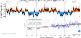 The AMO affects temperatures and sea-levels, mainly in the
North Atlantic, and accounts for a small part of the warming seen in the northern hemisphere since
the 1970s. Dr. Judith Curry has written a very informative
article about it.
Its correlation with sea-level is
seen most strikingly
at Murmansk, on the
Barents
Sea. ↑
 - The Pacific Decadal Oscillation (PDO)[2] is Pacific Ocean climate cycle of approximately 25-50 years duration. There's some discussion of it on WUWT. ↑
- NASA's GISS works with NCEI (née NCDC) to archive and analyze the U.S. Surface Temperature data. Since 1999, wholesale "adjustments" to the old data have added about 0.7 °C (1.26 °F) of warming to the 20th century's reported temperature trend! GISS has only the latest version on their web site, but I've compiled a collection of historical GISS "Fig.D" data files, back to mid-1999. ↑
- Anthony
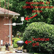 Watts' SurfaceStations.org project has definitively
demonstrated severe problems with the U.S. surface temperature record, problems which mostly inflate the
warming reported. Watts and a small army of volunteers have methodically surveyed and photographed over
1000 USHCN surface temperature measurement stations.
A large majority of the stations have major siting problems or other issues. When only high-quality
stations are analyzed, 37%
of NOAA's claimed U.S. warming trend for the last 30 years disappears.[2]
(Discussion
here.) ↑
 - SurfaceTemperatures.org is the web site of the International Surface Temperature Initiative, which aims to bring transparency to global surface temperature data. (There's a related article here.) ↑
- “Averaged” temperature trends are heavily affected by just what is being averaged. For example, when NASA GISS substitutes faster-rising polar land surface temperatures for slower-changing sea-surface temperatures in those regions, it exaggerates the “average” temperature trend. There is so much natural variation in temperature data that cherry-picking date intervals can greatly exaggerate (or hide) actual trends. ↑
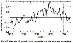
- In
 1975, the U.S. National Academy of Sciences published a Report
which, among other things, on p. 148 (or p. 172 as Adobe Reader numbers the pages)
graphed the sharp decline in Northern Hemisphere temperatures since the 1940s. That cooling trend
fueled the 1970s global cooling scare,
but most of the decline has been erased by subsequent adjustments to the historical data, which is suspiciously
convenient for the global warming alarmist narrative.
1975, the U.S. National Academy of Sciences published a Report
which, among other things, on p. 148 (or p. 172 as Adobe Reader numbers the pages)
graphed the sharp decline in Northern Hemisphere temperatures since the 1940s. That cooling trend
fueled the 1970s global cooling scare,
but most of the decline has been erased by subsequent adjustments to the historical data, which is suspiciously
convenient for the global warming alarmist narrative.The Climategate emails subsequently confirmed that that convenient change was no accident. ↑ - In Jan.-Feb. 2015 Journalist Christopher Booker and Dr. Kevin Cowtan had an argument about NOAA's adjustments to the global land surface temperature record, and sealevel.info webmaster Dave got involved. ↑
- “Climate Sensitivity” is a measure of the (in)stability of the Earth's temperatures,
most commonly defined as the globally averaged temperature increase to be expected from a doubling of atmospheric
carbon dioxide (e.g., an increase from 285 ppmv to 570 ppmv, or from
400 ppmv to 800 ppmv). (See also TCR and
ECS.)
The most straightforward and obvious way of estimating climate sensitivity to a doubling of CO2 is by examining the result of the “experiment” which we've performed on the Earth's climate, by raising the atmospheric CO2 level from about 311 ppmv in 1950 (or 285 ppmv in 1850) to about 408 ppmv in 2018. We simply examine what happened to temperatures when the atmospheric CO2 level was raised by 31% (or 43%), and extrapolate from those observations. If essentially all of the 20th century's estimated warming is attributed to anthropogenic forcings like CO2 and methane, it would imply a TCR (medium-term) climate sensitivity of 1.84 ±0.11 °C (Barrett), or 1.34 (0.91–2.44) °C (Lewis & Curry 2016), or 0.84-2.60 °C (best estimate 1.20-1.41 °C) (Lewis & Curry 2018, or preprint). To the extent that the 20th century's warming was natural, or due to other unaccounted for or underaccounted for anthropogenic forcings, or if the 20th century's warming has been overestimated (and estimates vary considerably), it means that TCR sensitivity is necessarily lower. ECS is defined as either "Equilibrium Climate Sensitivity" (EqCS) or "Effective Climate Sensitivity" (EfCS), two similar measures of very long-term (multiple century) climate sensitivity. Because some 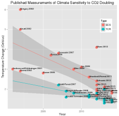 climate processes are very slow, ECS is thought to be significantly higher than TCR. I've seen the
ECS-to-TCR ratio
variously estimated between 1.25:1 and 2.28:1,
with 1.5:1 a typical estimate.
climate processes are very slow, ECS is thought to be significantly higher than TCR. I've seen the
ECS-to-TCR ratio
variously estimated between 1.25:1 and 2.28:1,
with 1.5:1 a typical estimate.AR5 estimates ECS sensitivity to be 1.5 °C to 4.5 °C (midrange 3.0 °C), assuming that 100% of the 20th century's warming was due to anthropogenic GHGs. Climate sensitivity estimates in the scientific literature and “baked into”[2] GCMs vary widely, but estimates in the literature have generally been declining, and are noticeably lower when deduced from measurement evidence than is assumed in most GCMs.[1][2][3][4][5][6] Unfortunately, the IPCC is slow to notice it. Prof. Ross McKitrick's June 20, 2018 Financial Post article is an exceptionally clear yet thorough discussion of the topic, and Climatologist Patrick J. Michaels' Feb. 28, 2017 Congressional Testimony included an excellent, in-depth discussion of climate sensitivity. ↑ - A 2014 paper by LLNL's Ben Santer, et al
sought to subtract out the effects of ENSO and the Pinatubo (1991) & El Chichón (1982) volcanic aerosols, from measured
(satellite) temperature data, to find the underlying temperature trends. This graph is "Fig. 1c" from that paper; the
black line is averaged CMIP5 models, the blue & red are measured temperatures:
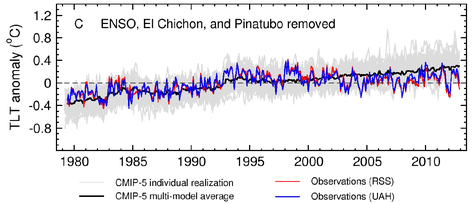
Two things stand out:1. The models run hot. The CMIP5 computer models (the black line), which are tuned with the assumption that at least 100% of 20th century warming is anthropogenic, and an average ECS climate sensitivity of about 3°C per doubling of CO2, show a lot more warming than the satellites. The models predict about 0.20°C/decade warming over the 34-year measurement period, but the satellites measured only about half that. And, 2. “The Pause” in global warming[2][3][4] began around 1993. The measured warming is all in the first 14 years (1979-1993). Their graph (with corrections to compensate for both ENSO and volcanic forcings) showed no noticeable warming since then. (Aside: “The Pause” ended with the arrival of the big 2015-2016 El Niño; subsequently, many climate activists have tried to pretend that it never happened.) Note, too, that although 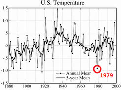 the Santer graph still shows an average of about
 0.1°C per decade of warming, that's partially because it starts in 1979. The late 1970s were the frigid end of an extended cooling period in the northern hemisphere, and 1979 was a particularly chilly year, as you can see in this graph of U.S. temperatures, from a 1999 Hansen/NASA paper.Christy & McNider (2017) (or preprint) did a similar exercise, and found a similar rate of warming (0.096°C/decade), and calculated a tropospheric TCR climate sensitivity of +1.10 ±0.26 °C per CO2 doubling, about half the average IPCC AR5 estimate. The paper is quite long, but here's a readable discussion. The fact that when volcanic aerosols & ENSO are accounted for the models run hot by about a factor of two is evidence that the IPCC's estimates of climate sensitivity are high by about a factor of two, and it suggests that a substantial part, perhaps half, of the global warming since the mid-1800s was natural, rather than anthropogenic. (See also this 2017 article by Prof. Ross McKitrick.) The models also perform poorly in other ways, e.g., by underestimating observed climate variability (preprint; related), and earlier models performed even worse. ↑ - In 2015, four researchers wrote a provocative paper, which sheds some light on the problems with the CMIP5 models: Monckton, Soon, Legates & Briggs, Why models run hot: results from an irreducibly simple climate model. Science Bulletin, 2015, 60(1): 122-135. (See also this article.) ↑
- Two half-century temperature records: Over
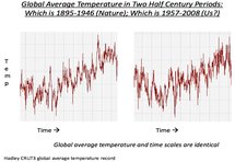 the half-century from 1895 to 1946 (when CO2 levels rose by
only about 15 ppmv) the ebbs and flows of the Earth's temperature
were
very similar to the half-century from 1957 to 2008 (when CO2 levels rose by about 70 ppmv).
Both periods saw similar secular trends, and similar amounts of net warming. In fact, the temperature graphs for the
two periods are so similar that you probably cannot guess which is which.
(You can closely reproduce the two graphs
at WoodForTrees,
with a 0.35 °C temperature offset between the two periods, which are 62 years apart.)
the half-century from 1895 to 1946 (when CO2 levels rose by
only about 15 ppmv) the ebbs and flows of the Earth's temperature
were
very similar to the half-century from 1957 to 2008 (when CO2 levels rose by about 70 ppmv).
Both periods saw similar secular trends, and similar amounts of net warming. In fact, the temperature graphs for the
two periods are so similar that you probably cannot guess which is which.
(You can closely reproduce the two graphs
at WoodForTrees,
with a 0.35 °C temperature offset between the two periods, which are 62 years apart.)In the half-century covered by the 1895–1946 graph atmospheric CO2 rose by only 15 ppmv (5.3%), and in the half-century covered by the 1957–2008 graph CO2 rose by 70 ppmv (22.5%), i.e., a 4.2× greater CO2 forcing. I do not doubt that rising CO2 level contributed to warming, but the similarity of the two graphs, despite the huge dissimilarity of the two CO2-forcings, obviously doesn't support the case for CO2 being the “principal control knob” for climate. The global warming between 1895 and 1946 was presumably mostly natural, because anthropogenic GHG emissions were very low. So how can the IPCC claim to be certain that all or nearly all of the warming from 1957 to 2008 was due to anthropogenic GHG emissions? That seems like hubris, to me. (h/t Warren Meyer.) ↑ - If that “current” warming trend of about 0.1°C per decade continues through
the rest of the 21st century, it will add nearly 1°C to average temperatures (more in the Arctic,
less in the tropics). That's a bit less than the warming which the Earth has experienced since the depths of the
Little Ice Age in the 1700s (which has been generally
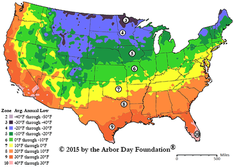 beneficial).
To get a very rough idea of how that amount of warming would affect the climate where you live, you can consult a gardeners' climate/hardiness zone map, like this one. From the map you can see that, in the United States, 1°C (1.8°F) of warming would, on average, be roughly equivalent to moving 50 to 80 miles south. ↑ - When considering the effects of global warming on human health, never forget that cold weather is far more dangerous than hot weather. ↑
- NOAA has measurement data and graphs
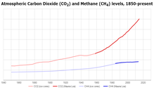 of atmospheric
carbon dioxide & methane trends at Mauna Loa, Hawaii, where CO2 has been precisely and continuously measured
by modern spectroscopy
since March, 1958, and CH4 since 1984.
(Measurements from Other locations began more recently.)
Outdoor CO2 levels at Mauna Loa average about 405 ppmv, and are increasing by a little over
2 ppmv/year. (Indoor CO2 levels are typically much higher.)
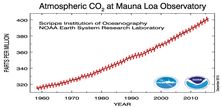 Prior to 1958, CO2 measurements (by chemical
methods) are generally thought to have been less reliable (and were certainly
less consistent)
than modern spectrographic measurements, but modern measurements of CO2
levels in “old air” samples trapped in tiny bubbles in Antarctic
ice cores
give fairly consistent results
(though there are concerns about distortions from bacterial action, and
reliably dating those measurements is more challenging).[1]
[2]
[3] ↑
 - A few people
claim that the reason atmospheric CO2 levels are rising
is not mankind's CO2 emissions, but, rather, that the oceans are outgassing CO2,
because of global warming.
Those people are wrong.
The late Dr. Murry Salby was one of them. He has a long lecture on YouTube, making that claim. I critiqued it here. The most thorough examination of the cause of rising CO2 concentration which I've found is this very clear and comprehensive analysis, by Ferdinand Engelbeen. ↑ - Contrary to
 a widespread Internet hoax, volcanoes contribute a negligible amount of CO2 to the atmosphere,
compared to human emissions, on human time scales. (On geological time scales it's a different matter.)
a widespread Internet hoax, volcanoes contribute a negligible amount of CO2 to the atmosphere,
compared to human emissions, on human time scales. (On geological time scales it's a different matter.)In a graph of CO2 levels, you can't even see the increase in measured CO2 levels far away from a volcano, not even from the enormous 1991 Mt. Pinatubo eruption, and certainly not from Mt. Etna. In fact, the opposite is true. A temporary reduction in the growth rate of atmospheric CO2 was noticeable over the 2 to 3 years following the Mt. Pinatubo eruption, perhaps because particulates ejected by the eruption cooled the planet, which temporarily increased CO2 absorption by the oceans (because gases like CO2 dissolve more readily in cool water than in warmer water), and/or perhaps because iron and other minerals in the volcanic ash fertilized the ocean and thereby increased CO2 uptake by ocean biota (Sarmiento, 1993 [pdf]), and/or perhaps because of the effects of sunlight scattering on vegetation growth (Farquhar & Roderick, 2003 [pdf]). Most scientists estimate that mankind's CO2 emissions from burning fossil fuels and making concrete are more than 20 times as large as total CO2 emissions from all volcanoes. The highest estimate I've seen for volcanic CO2 emissions is about 0.5 Gt/year[2] for terrestrial volcanoes, plus whatever submarine volcanoes emit. Even if submarine volcanoes emit 2.5× that, the total would still be less than 2 Gt/year (compared to about 40 Gt/year for mankind's emissions). (Caveat: estimates of volcanic CO2 emission rates are very rough, and rates from submarine volcanoes are really just guesses, and some geologists — notably Ian Plimer — think they are badly underestimated.) The good news is that's not a problem. Just the opposite, in fact. Read on... ↑ - Numerous studies
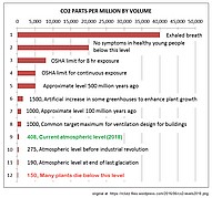 have found that CO2 levels
elevated to more than eight times the current average ambient outdoor level of 400 ppmv (0.04%) are
harmless
to humans and animals. NASA kept the atmosphere in the
Space Shuttle at about 5000 ppmv (0.5%) CO2.
The air in the International Space Station
is kept at about 4 mm Hg = 5400 ppmv (0.54%) CO2,
though one study recommends
that they lower that to 2.5 mm Hg = 3300 ppmv. CO2 levels in
submarines
are often even higher. ↑
 - But
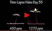 it has long been known that elevated CO2 levels are
highly beneficial to plants.
That's why most commercial greenhouses use CO2 generators
to keep CO2 at 3x to 4x ambient levels, at significant expense.
That's an increase 8 to 12 times as great as the ~100 ppmv
increase which ⅔ century of heavy fossil fuel use has caused in outdoor levels.
Greenhouse operators spend the money to keep CO2 levels that high because doing so
dramatically improves
the growth and health of most plants.
it has long been known that elevated CO2 levels are
highly beneficial to plants.
That's why most commercial greenhouses use CO2 generators
to keep CO2 at 3x to 4x ambient levels, at significant expense.
That's an increase 8 to 12 times as great as the ~100 ppmv
increase which ⅔ century of heavy fossil fuel use has caused in outdoor levels.
Greenhouse operators spend the money to keep CO2 levels that high because doing so
dramatically improves
the growth and health of most plants.In 1920 it was reported  by Scientific American
(and re-reported elsewhere)
that experiments with carbon dioxide enrichment showed that CO2 from blast
furnace exhaust gas could be used to increase various crop yields by from 100% to 300%.
Scientific American called CO2 “the precious air fertilizer.”
Crops tested included tomatoes, spinach, castor oil plants, potatoes, lupines, and
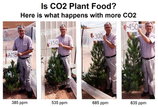 barley.
Conversely, low CO2 concentrations are very detrimental to plants, and levels which stay below about 150 ppmv threaten the viability of C3 plants. That's one of the reasons that 20th century global warming has been accompanied by dramatic improvements in agricultural productivity. According to World Bank data, global crop yields have almost tripled since chilly 1960, and one of the reasons is CO2 fertilization. All fruits and vegetables benefit from extra CO2, and yields also continue to rise for staple crops like wheat, rice, corn & soybeans. ↑ As 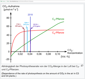 you can see in this graph, current CO2 levels are far below optimum for most plants.
There are three main types of photosynthesis in plants: C3 (most plants), C4 (mainly corn, sugarcane, sorghum, millet, and some warm-season turf grasses, like Zoysia & Centipede), and CAM (mainly pineapples & cacti). C3 & CAM plants benefit the most from extra CO2, but even C4 plants like corn benefit significantly [2], especially when drought-stressed. That's because extra CO2 makes plants more drought resistant and water-efficient, by improving stomatal conductance relative to transpiration, which is especially helpful in arid regions. (Google finds many articles about it.) When air passes through plant stomata (pores), two things happen: the plant absorbs CO2, and the plant loses water through transpiration. When CO2 levels are higher, the ratio of CO2 absorbed to water lost improves, which improves both plant growth and drought resistance. The plants also commonly respond to elevated CO2 by reducing the density of the stomata in their leaves, which reduces water loss. Recent research has found that, "Land plants are absorbing 17% more carbon dioxide from the atmosphere now than 30 years ago... [yet] the vegetation is hardly using any extra water to do it, suggesting that global change is causing the world's plants to grow in a more water-efficient way." Another analysis, using a different methodology, reached a similar conclusion. They reported that, "at the global scale, land plants have regulated their stomatal conductance so as to allow the CO2 partial pressure within stomatal cavities and their intrinsic water use efficiency to increase in nearly constant proportion to the rise in atmospheric CO2 concentration." As 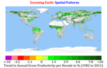 a result, some of the world's
deserts
and near-deserts are greening (or here, or here),
especially in
Africa.
a result, some of the world's
deserts
and near-deserts are greening (or here, or here),
especially in
Africa.In fact, the whole Earth is getting greener, and studies indicate that the primary cause is anthropogenic CO2, and the secondary cause is climate change. Recent research indicates that elevated CO2 even helps salt marshes resist encroachment by rising sea-level, because the extra CO2 helps the vegetation grow faster. Hundreds of other studies confirm that elevated CO2 levels are highly beneficial to almost all plants, and experimental evidence suggests that many of those studies underestimate the benefit. Prof. Freeman Dyson, who was, until his death February 28, 2020, America's most distinguished living scientist (the man who took over Albert Einstein's old job at the IAS, in Princeton, NJ), said, "It's certainly true that carbon dioxide is good for vegetation. About 15 percent of agricultural yields are due to CO2 we put in the atmosphere. From that point of view, it's a real plus to burn coal and oil." ↑ - Here's a useful web site which shows how to calculate the amount of CO2 supplementation to maximize crop yields (for indoor growing), and an online calculator. (Google finds others, too.) ↑
- Some climate alarmists have claimed that rising CO2 levels
make food crops less nutritious.
I had an on-line debate
on Quora
with the most prominent promoter of that scare, mathematician Irakli Loladze.
(If you're not a Quora member, I don't think you can read his comments, so I also saved our
dialogue here.)
The bottom line is that the nutrient scare is a red herring. It is possible to contrive conditions under which faster growth rates causes crops to have lower levels (though not lower overall quantities) of some nutrients, but that minor effect does not occur when best agricultural fertilization practices are employed. ↑ - Princeton
 atmospheric physicist Prof. William Happer (bio here)
was a friend and colleague of Prof. Freeman Dyson. He is
one of the world's leading experts on the absorption & emission spectra, mechanisms, and warming effect of CO2.
In 2014 he gave a very informative lecture as part of the UNC Physics Colloquium series. Unfortunately, no
video recording was made, but I made an audio recording, and he kindly sent me his slides, which I combined
with the audio recording to make a video.
atmospheric physicist Prof. William Happer (bio here)
was a friend and colleague of Prof. Freeman Dyson. He is
one of the world's leading experts on the absorption & emission spectra, mechanisms, and warming effect of CO2.
In 2014 he gave a very informative lecture as part of the UNC Physics Colloquium series. Unfortunately, no
video recording was made, but I made an audio recording, and he kindly sent me his slides, which I combined
with the audio recording to make a video.In 2016 he began a delightful and very informative in-depth conversation/ debate with two leading climate alarmists, hosted by TheBestSchools.org. It is well worth reading. ↑ - Prof. Raymond Pierrehumbert's 2011
article on infrared radiative transfer theory is a thorough and very understandable introduction to
how so-called† “greenhouse gasses” warm the Earth (and other planets).
This 2012 paper by D. J. Wilson
and J. Gea-Banacloche is a good follow-up, with a more quantitative analysis.
(†I say “so-called” because the “greenhouse effect” is poorly named, since that's not how greenhouses actually work. But the effect is nevertheless real.) ↑ - Estimates of the “radiative forcing”
(RF or ΔF) from additional atmospheric CO2 vary widely,
and estimates used in CMIP5 models differ by ratios of up to
1.65-to-1. The current IPCC estimate is that doubling atmospheric CO2 (e.g., an increase from 400 ppmv to 800 ppmv) would cause the equivalent of an average TOA solar radiation increase of 3.7±0.4 W/m² (i.e., about +1.1%) before feedbacks, but Prof. Happer has calculated that that's overestimated by about 40%.Additionally, CO2 has a logarithmically diminishing warming effect, due to saturation of CO2's main IR absorption bands. In other words, a CO2 level increase from 400 to 800 ppmv would have about the same warming effect that a CO2 level increase from 200 to 400 ppmv had. MODTRAN calculates that about 20 ppmv (and the NCAR Radiation Code calculates 40 ppmv) of CO2 would generate about half the warming produced by the current ≈414 ppmv. “CO2 forcing” has been monotonically increasing since about 1950, and the rate of forcing increase has been approximately linear since the late 1970s. (CO2 levels have been increasing exponentially, but the effect of rising CO2 levels diminishes logarithmically, so the net effect is asymptotically approaching linear.) The growth in CO2 forcing will probably fall below linear over the remainder of the 21st century, resulting in a slowdown in CO2-driven warming of the Earth's climate. ↑ - Barrett Bellamy Climate has a wealth of authoritative, in-depth information about how CO2 and other GHGs affect climate. ↑
- Ferdinand Engelbeen has a web site with excellent, clearly presented, scientifically sound information about a number of climate-related topics, such as this page explaining how we know that the increases in CO2 levels over the last century are due to anthropogenic emissions. ↑
- Some people seem to think that CO2 levels can increase without limit. They can't. Already, more than half of the CO2 emitted each year by using fossil fuels is removed by powerful negative (stabilizing) feedbacks, and as levels increase so does the rate at which those mechanisms remove it. Those feedbacks, and the finite supply of fossil fuels which ultimately constrains total emissions,[1][2] limit how high CO2 levels can plausibly rise. ↑
- Methane (CH4) is also a greenhouse gas, but
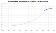 the warming effect of anthropogenic methane is slight.
There's only about 1.9 ppmv of methane in the atmosphere. A “big” increase in methane levels might be on the order of +0.1 or +0.2 ppmv (i.e, from 1.9 to 2.0 or 2.1 ppmv). The warming effect of methane is about 40 to 45 times that of CO2, so increasing CH4 by 0.1 ppmv would warm the planet at most about as much as a 4.5 ppmv (about 1.1%) increase in CO2 — i.e., negligible. What's more, the effect of a spike in methane levels would be very transient, because even if you don't burn it, methane in the atmosphere oxidizes with a half-life of only about 6–8 years, into harmless CO2 and water: CH4 + 2·O2 → CO2 + 2·H2O ↑ - Contrary to the yellow journalism which dominates climate reporting, even very
large methane emissions have very little effect.
For example, in late 2015 an unusually large natural gas leak in Aliso Canyon, California made headlines. An estimated 107,000 tons of methane (CH4) were released over a period of 112 days. Google finds thousands of articles calling it a “disaster” or “catastrophe.” The Washington Post coverage was typical. They described it with apocalyptic terms like “massive,” “worst,” “historic,” “disaster,” and “huge” – and that was all in one article. Their headline screamed: “California gas leak was the worst man-made greenhouse-gas disaster in U.S. history.” They lied. “107,000 tons of methane” sounds like a lot, but it isn't. The WaPo used the wrong units, to make something tiny sound huge. It's a common climate propaganda technique. The amount of CH4 in the atmosphere is not normally expressed in “tons.” It is expressed in gigatonnes. One gigatonne is a billion metric tonnes, so 107,000 tons is only 0.000097 metric Gt (about one ten-thousandth of a gigatonne). The 0.000097 Gt of CH4 released by that massive, huge, worst, historic disaster amounted to less than 0.002% of the estimated 5.284 Gt of methane already in the Earth's atmosphere. It presumably caused an undetectably tiny 0.000033 ppmv spike in the Earth's atmospheric methane levels, with the temporary warming equivalent of about 0.0015 ppmv CO2 (about 6 hours' worth, at the current rate of CO2 increase), diminishing to half that in 6–8 years. The WaPo was predictably uninterested in a Letter to the Editor correcting the misinformation. ↑ - The EC Joint Research Centre's Emission Database for Global Atmospheric Research (EDGAR) has estimated anthropogenic carbon dioxide and overall GHG emissions by country. ↑
- The LWIR absorption bands of most greenhouse gasses are listed here (from Prof. Irina Sokolik's course on Atmospheric Radiative Transfer). ↑
- CDIAC (Carbon Dioxide Information Analysis Center) cdiac.esd.ornl.gov is part of the U.S. Department of Energy. ↑
- 31,487 American scientists (including sealevel.info webmaster Dave Burton, and
including engineers in relevant specialties) have signed the
Global Warming Petition, signifying our
agreement with this statement:
“There is no convincing scientific evidence that human release of carbon dioxide, methane, or other greenhouse gases is causing or will, in the foreseeable future, cause catastrophic heating of the Earth's atmosphere and disruption of the Earth's climate. Moreover, there is substantial scientific evidence that increases in atmospheric carbon dioxide produce many beneficial effects upon the natural plant and animal environments of the Earth.” ↑ - The World Climate Declaration
(also known as the European Climate Declaration) is subtitled, There Is No Climate Emergency. It is from the Amsterdam-based
Climate Intelligence Foundation [CLINTEL] (article here),
in response to the “climate crisis” / “climate emergency” hype. It is signed by
799821 scientists (including sealevel.info webmaster Dave), from 32 countries. ↑ - The 2009 Copenhagen climate Challenge was an open letter, signed by 166 scientists well-qualified in climate science (+ 29 more in related fields), addressed to UN Secretary General Ban Ki-moon, denouncing “claims of dangerous human-caused global warming.” ↑
- The 2008 Manhattan Declaration on Climate Change declared that, “That there is no convincing evidence that CO2 emissions from modern industrial activity has in the past, is now, or will in the future cause catastrophic climate change,” and, “human-caused climate change is not a global crisis.” It was endorsed by 825 scientists with relevant expertise, plus 671 members of the general public. ↑
- A climate activist blogger named Jim Prall has compiled a list of “most-cited” scientists who've signed statements either in support of climate alarmism or against it, though he ignored the largest such list of skeptics. He also has a separate subset of that list, which apparently consists of all IPCC AR4 Working Group 1 Authors (mentioned in one of the Climategate emails). He also has a separate “blacklist” subset of just skeptics & lukewarmists (criticized here, here and here). He also has a list of “most-followed” Twitter accounts of climate activists (but none on the skeptic side). ↑
- Energy Citizens lobbies in the USA for sound energy policies.
- PTCfacts.info is a site about the (problems with) Wind Production Tax Credits.
- North Carolina Energy Coalition, sponsored by the American Petroleum Institute (now defunct).
- AdvancedEnergyForLife.com was a site by coal producer Peabody Energy, with an interesting graph showing the correlation between the size of the world's economy and the use of coal to produce electricity.
- Does fracking cause earthquakes? Climatologist Anthony Watts examines the evidence.
- Roger Andrews' & Euan Mearns' “Energy Matters” blog is excellent. ↑
- Beware of ”renewable energy” projects, such as wind farms. Both economically and environmentally, they are far worse
than fossil fuels and nuclear power plants.
Economically, wind and solar are problematic because they are expensive and highly intermittent, which means they're unsuitable for base load power generation, and large-scale deployment destabilizes the power grid. The costs can be deadly. “Energy poverty” is reported to have killed 15,000 mostly-elderly people in the UK in the winter of 2014-15, and even more in Europe as a whole, largely because renewable energy projects have inflated the cost of energy. Wind energy is also devastating to some kinds of birds and bats. Here's an excellent article in Norwegian, and Google-translated to English. Save The Eagles International is an organization dedicated to protecting eagles from the wind turbine menace. ↑
 classic 1965 educational film from Encyclopedia Britannica Films and
the American Geological Institute, courtesy of the LSU Center for GeoInformatics:
 Roy K. Dokka:
http://ioc-goos-oopc.org
http://forecast.uchicago.edu/Projects/modtran.orig.html
http://forecast.uchicago.edu/models.html
http://climatemodels.uchicago.edu/
(See also the AER Radiative Transfer Working Group web site, and also above.) ↑
 highly applicable to climatology (but widely ignored).
The most prominent expert in the field is the Wharton School's
Prof. J. Scott Armstrong. His six minute long
testimony
on Polar Bear
population forecasting, before the U.S. Senate Environment and Public Works Committee,
in 2008, was enlightening. ↑
 an interesting website, speech and slide presentation entitled, "The Colder Side of Global Warming," which you can view here:
 scientists have speculated that anthropogenic warming could cause an increase in the frequency
and/or intensity of “extreme weather” events, like hurricanes and
tornadoes. However,
that has not happened,
thus far. Here are some graphs:
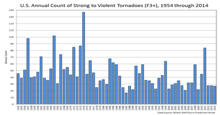 And papers:
 scientists have speculated that global warming will worsen droughts. Among Americans, that speculation might be
fueled by the fact that in the United States the warm 1930s coincided with “dust bowl” conditions on
the American Great Plains. However, historically, warm periods have not usually been associated with droughts.
 it's the secret of
climate that we've searched for so long,” writes Willis.
“Only problem? …”
it's the secret of
climate that we've searched for so long,” writes Willis.
“Only problem? …”http://www.tylervigen.com/spurious-correlations ↑
 Sun might be entering a "quiet" phase, perhaps even similar to the Maunder
and Dalton Minimums during the Little Ice Age. Contrary to
NASA's 2006
(and most other)
predictions, Solar Cycle 24 was very weak.
However, Solar Cycle 25 is on track to be stronger than
predicted. ↑
Sun might be entering a "quiet" phase, perhaps even similar to the Maunder
and Dalton Minimums during the Little Ice Age. Contrary to
NASA's 2006
(and most other)
predictions, Solar Cycle 24 was very weak.
However, Solar Cycle 25 is on track to be stronger than
predicted. ↑http://www.co2science.org/data/mwp/mwpp.php
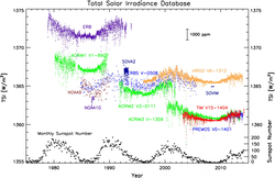 with certainty. Total Solar Irradiance (TSI) has been
measured
with fair precision by several satellites. It is not believed to
change much with variations in sunspot activity (though just how much is
disputed),
so if those tiny TSI changes were triggering large climate shifts, it would suggest that the Earth's climate balance is quite unstable,
and climate sensitivity must be implausibly high. ↑
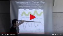 the Earth, which affects cloud formation (by affecting nucleation
of condesnsing water droplets), which, in turn, affects climate.
 used to be that most scientists agreed that, over the last few thousand years, the Earth's
climate has oscillated, on timescales of a few centuries or more, between warm “climate optimums” and unpleasant
cold periods: the long Holocene Climate Optimum (when
temperatures were apparently substantially warmer than now),
followed by a cooler period,
then the Minoan or Bronze Age Warm Period,
followed by the Iron Age Cold Period,
then the Roman Warm Period or Roman Climate Optimum (“RWP”),
then the Dark Ages Cold Period (“DACP”),
then the Medieval Warm Period or Medieval Climate Optimum (“MWP”),
then the Little Ice Age (“LIA”),
and finally the Current Warm Period (Modern Climate Optimum).
However, that chronology represents a problem for climate alarmism, since it indicates that there's nothing particularly
unusual about the warming which occurred during the 20th century. ↑
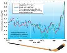 a pair of papers in 1998 (in Nature) and
1999 (in GRL), Mann, Bradley & Hughes
challenged that orthodoxy with a new temperature reconstruction, a/k/a their heavily-hyped “hockey stick.”
It erased the MWP, and mostly erased the LIA, to create a straight “hockey stick handle” from 1000 AD to 1900 AD,
followed by a sharp “hockey stick blade” of rising temperatures in the 20th century.
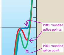 splicing measured temperature data into a graph of temperature “proxies,”
to “hide the decline”
in climate proxies, which would have spoiled the “hockey stick shape” of the graph, discredited their tree ring proxy-based
temperature reconstruction methodology, and undermined the narrative of alarming
global warming.
splicing measured temperature data into a graph of temperature “proxies,”
to “hide the decline”
in climate proxies, which would have spoiled the “hockey stick shape” of the graph, discredited their tree ring proxy-based
temperature reconstruction methodology, and undermined the narrative of alarming
global warming.- On one side, the indispensable CO2 Science project has compiled an extensive
collection of studies and papers with evidence for the traditional view:
that the MWP and LIA were real and global.
Also, here are two articles and a map, showing the preponderance of studies which support that view. Also, the SPPI has produced a series of useful white papers reviewing what is known about the MWP in various regions of the world. Also, here's a blog post which summarizes and links to a dozen recent papers about the warm MWP. - On the other side, the Pages 2K Network
(or here) was created in 2008,
to compile evidence for the merely “regional nature of the Medieval Warm Period and the Little Ice
Age.” (That contention is quoted from the caption on Fig. 1 of
their poster,
though they more frequently use the revisionist term,
“Medieval Climate Anomaly”
or MCA.)
2018-10-07: Canadian mathematician Steve McIntyre has written an excellent multi-part critique of the Pages2K project here, and has compiled a large collection of “hockey stick study” resources here. 2020-07-16: Ice cores from ice sheets contain tiny air bubbles, which record CO2 levels (among other things) from thousands of years in the past. (The records are quite precise for the last 400K years, and less precise for twice that long.) They show that, prior to the industrial revolution, CO2 levels typically rose & fell as a result of global temperature changes, rising a total of about 90 ppmv from glacial maxima to interglacial peaks. Here are Law Dome (Antarctic) ice core data, back to year 1010. (Scroll down past “CO2, 75 Year Smoothed.”) They show CO2 levels peaked at ≈284.1 ppmv circa 1170 (MWP), and fell to their lowest level of ≈275.3 ppmv circa 1615 (LIA):
https://www1.ncdc.noaa.gov/pub/data/paleo/icecore/antarctica/law/law_co2.txtThat's a problem for the Pages 2K claim that the MWP was merely regional / North Atlantic, because they cannot explain it showing up in CO2 records, all the way down in Antarctica. ‡
"The CRU e-mails as published on the internet provide prima facie evidence of determined and co-ordinated refusals to comply with honourable scientific traditions and freedom of information law. The principle that scientists should be willing to expose their ideas and results to independent testing and replication by others, which requires the open exchange of data, procedures and materials, is vital. The lack of compliance has been confirmed by the findings of the Information Commissioner. This extends well beyond the CRU itself most of the e-mails were exchanged with researchers in a number of other international institutions who are also involved in the formulation of the IPCC's conclusions on climate change."Bishop Hill's blog has a brief but excellent summary (or here) of the most incriminating Climategate emails, and Dr. John Costella did a far more extensive analysis.
CLIMATEGATE: Untangling Myth and Reality Ten Years Later.
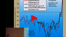 In this video, Berkeley professor Richard A. Muller,
a longtime climate alarmist who now
describes himself as a lukewarmist,
did a very good job of explaining Michael Mann's infamous
Climategate “Nature trick” to “hide the decline” in proxy-derived temperature
estimates.
 Canadian mathematician and statistician
Steve McIntyre explains the scandal in more depth.
Last modified: 21-Apr-2026 (version 256)
Copyright © 2012-2023, David A. Burton.
Note: the “last modified” date and version number on this web
page are maintained automatically by TLIB Version Control.
