See also: https://sealevel.info/climate/Re_CSRRT_Enquiry--Burton--US_Surface_Temperature_USHCN_chron.html

My 12/28/2018 comment on the IBD editorial entitled, “The stunning statistical fraud behind the global warming scare”
by Dave Burton
If I'd written the article, the tone would have been different. But the gist is correct. This is a quote from the article:
"The key point here is that while NOAA frequently makes these adjustments to the raw data, it has never offered a convincing explanation as to why they are necessary," wrote James Delingpole recently...
That is true.
NASA used to say that 1934 was the warmest year in U.S. (contiguous 48-State) history. But U.S. surface temperature data has been greatly adjusted, and the adjustments drastically increased the amount of reported warming in the continental USA during the 20th century, particularly when the 1930s are compared to the 1990s & beyond.
Published papers explain the rationale for only PART of those adjustments:
1930s vs 1990s adjustment effects (±0.01°F):
TOBS (area adj & TOB adj): +0.34 °F
MMTS (sensor change adj): + 0.04 °F
SHAP (station history adj): +0.20 °F
FILNET (missing data est): +0.02 °F
FINAL (urban heat island adj): -0.06 °F
sum: +0.52 °F
Seven years ago I asked Prof. Scott Mandia of the CSRRT about the surface temperature record of the 48 contiguous United States, the current annualized and averaged version of which NASA GISS now shows here:
...and has graphed here:

(Note: for some unknown reason they set the background to "transparent," and some web browsers show it as black. So if it has a black background, try viewing it in Mozilla FireFox.)
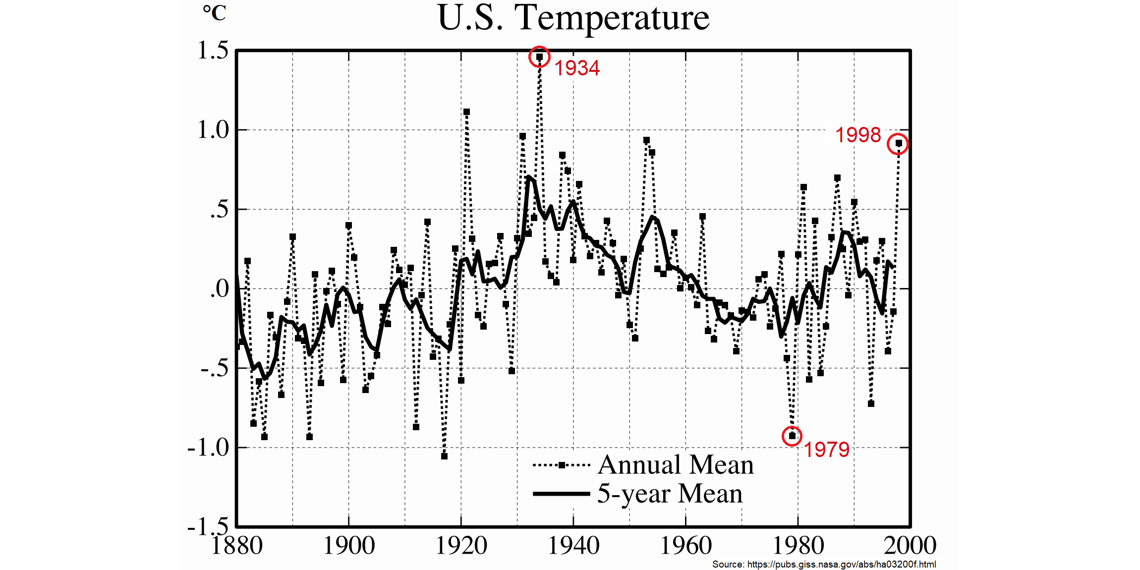
As of late 2011 it looked like this (scaled to match the graph below):
But in 1999, their graph of the same(?) temperatures looked VERY different:
(sources: article, high-res version from Fig. 6 of paper)
(scaled to match the graph above)
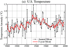
If you examine the two versions of the graph, and compare 1930s temperatures with 1990s temperatures, you can see that the newer version ADDS ABOUT
I asked the CSRRT:
1. What accounts for the unexplained part of the adjustments, made since 1999, which increased the reported U.S. surface temperature warming?
2. Where's the data which Hansen et al graphed in their 1999 paper?
They were unable to answer those questions.
A 1999 article by Drs. Hansen, Ruedy, et al, said, "in the U.S. the warmest decade was the 1930s and the warmest year was 1934."
A longer article by Dr. Hansen in 2000 (which NASA subsequently deleted or moved from their server) said, "it is clear that 1998 did not match the record warmth of 1934."
But NOW NASA SAYS JUST THE OPPOSITE: that 1998 was warmer than 1934 in the contiguous (lower 48) United States.
So what was "clear" to NASA in 2000 has subsequently been found to be untrue, apparently as the result of the accumulated adjustments/corrections which have been made to the data since 1999 -- some of which aren't even cursorily explained anywhere.

(Note: I imagine that someone will volunteer that the USA is only 2% of planet Earth, so those unexplained adjustments to the U.S. temperature data had little effect on the global average. If you're that "someone," please go ahead and tell me which temperature data you think are more trustworthy than the U.S. data.)