On Sun, Dec 18, 2011 at 8:23 AM, Scott Mandia wrote:
Thank you for this link. However, I don't find any quantitative information about the 48-State
temperature record & how it was adjusted there. There're no station lists, no weightings, no per-station
data (let alone per-station before-and-after-adjustment versions or per-station adjustments), not even a mention of
the fact that different adjustments were applied, both between 1999 and 2000, and between 2001 and present, in
addition to the adjustments made in 2000 which are noted in your 2001 paper.
It does say, "The NASA GISS Web site for
the global temperature data of Hansen et al. is the most comprehensive and direct source of information for these
data."
However, I've already search that site in vain for unadjusted data and old (circa 1999) data.
The WaybackMachine web site only has archives for that site back to 2005:
I've downloaded the source code, and I'm an IT guy (Masters in CS), so I can probably figure it out,
but it'll take some time.
which is also very interesting, but it doesn't have much information about the specifics of the
updates, and has no information at all about the adjustments made prior to the changes described in your 2001
paper.
(It is mildly amusing but also disappointing to me that, despite all the discussion on that page of
the 2007 correction to the "Y2K-ish" goof that Stephen McIntyre found, there's no thank-you or even mention of
McIntyre on that page!)
Here are the links to the various USHCN
versions:
This is interesting, too. However, I don't see any raw data there, nor even the averaged,
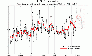
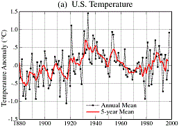
annualized 1999 version of the Fig.D, used to create that 1999 graph(a). Did I overlook it?
Digression: I'm a sea level guy, not a temperature guy, so there are a lot of holes in my
knowledge about temperature stats; please forgive my ignorance! But I noticed an interesting coincidence.
NOAA's reported "optimum"
grid (2.5 deg x 3.5 deg) for temperature analysis is similar to another climate-related number. When I
examined the correlation between sea level trends at coastal tide stations vs. distance between the stations, I found
only a slight correlation (other than the global trend) at distances greater than ~400 km (~250 mi), which is just a
little larger than the average distance between grid lines on NOAA's "optimum" grid. Odd, eh?
Especially interesting on that page are the graphs showing the effects of several adjustments:
Eyeballing the 2nd graph, it appears to show the following 1930s vs 1990s adjustment effects:
TOBS (area adj & TOB adj): +0.34 F
MMTS (sensor change adj): + 0.04 F
SHAP (station history adj): +0.20 F
FILNET (missing data est): +0.02 F
FINAL (urban heat island adj): -0.06 F
----------------------
sum: +0.54 F = 0.30 C
(that's the same total as the adjustments described in your 2001 paper, or about half of the total
1999-to-present adjustments visible in the NASA graphs which Mr. Goddard compared)
(My eyeballed numbers are apparently off by about 4%; the page's
summation graph shows a total about +0.52 F adjustment to the 1990s as compared to the 1930s.)
One interesting -- and surprising, to me -- note was in the explanation of the SHAP adjustment, which adds ~0.2
F of 1030s-to-1990s warming, and for which the page says, "from 1950 to
1980... many sites were relocated from city locations to airports and from roof tops to grassy areas. This often
resulted in cooler readings than were observed at the previous sites..."
That information is new to me. My impression was that the opposite effect was more common:
gradual urban encroachment would cause properly-sited grassy-area stations to become surrounded by buildings, parking
lots, roads, runways, etc.. Anthony Watts is obviously the leading expert on temperature station siting issues,
so I'm going to cc this email to him. Perhaps he'll weigh in.
This page is also interesting, if somewhat disconcerting.
The discussion of "Homogeneity Testing and Adjustment Procedures," makes me mildly queasy.
The statistical tests described there seem like an excellent approach to identifying candidate stations,
which might have been moved or been otherwise affected by site quality issues. But it seems to me
that the changes should have been verified manually, by contacting whoever runs the stations, and simply
asking them about any apparent discontinuities, and thus correcting the deficiencies in the station metadata,
rather than "correcting" for changes that might not have
actually happened.
The use of satellite night-illumination data as a proxy for urban warming also seems crude, to me.
We have population counts by census tract, maps with roads and municipal boundaries, google maps views for
counting buildings, etc., not to mention the station metadata and surfacestations.org reports for most stations.
It is too bad that, unlike the v1 page, this v2 page seems to have no quantitative information about the effects of
the various adjustments.
It is mildly amusing but also disappointing to me that, just as NASA avoided mentioning McIntylre
while discussing his work, this NOAA page manages to extensively discuss (and to some extent rebut) Anthony Watts'
surfacestations.org project and its findings, without
ever thanking him and his team, or even mentioning him by name! There seems to be a rather petty "us vs.
them" attitude in much of the climate research community, rather than a spirit of cooperation in scientific
discovery.
There's a lot of data here, but I don't see any U.S 48-state averages or graphs at all for v3.
It appears that none of these pages have the averaged, annualized 1999 version of
the Fig.D used to create
that 1999 (a) graph, nor
any information about the adjustments which were made between that 1999 version and the "unadjusted" version
discussed in your 2001 paper, nor even the station list and weighting/averaging process used.
My guess is that the equivalent of Fig.D used to be on either the NASA or NOAA web site, somewhere,
but it appears to have been at its current location only since about 2006 (at least this
2006 version is the oldest one archived by The WaybackMachine).
Can you please help me find these things?
I must admit that I do not understand your
comment "What was "clear" to NASA in 2001
apparently is known to be untrue, now. That makes me wonder what might be clear to NASA today which will be
found to be untrue in the future."
Sorry, my mistake. It was 2000, not 2001. (The copy of the article I found was in a 2001
WaybackMachine archive, but the article itself was from 2000.)
A 1999 article by Drs. Hansen, Ruedy, et al, said, "in the U.S. the warmest decade was the 1930s and
the warmest year was 1934," and a longer article by Dr. Hansen in 2000 said, "it is
clear that 1998 did not match the record warmth of 1934."
But now NASA says just the opposite: that 1998 was warmer than 1934.
So what was "clear" to NASA in 2000 has subsequently been found to be untrue, apparently as the
result of the accumulated adjustments/corrections which have been made to the data since 1999.
Analyses and data today are typically better
than those from earlier times. This is how science advances. Regardless of what happened in the
1930s in a small region of the world (US), it is clear from many different data sources and techniques that
the world is warming and GHGs are the primary reason. Do not lose site of the forest because one tree
has been made to look suspect by a person (Goddard) who lacks skills and believes in global
conspiracies.
Why do you keep attacking Goddard? Goddard's contrast of NASA's 48-state temperature graph
produced in 1999 to the same graph produced recently was not the product of any lack of skills or belief in global
conspiracies. It is very interesting and informative! Had he not done that, I would not have even
realized that recent adjustments to the U.S. surface temperature record account for all of the reported
warming when the 1990s are compared to the 1930s.
So I naturally wondered about the quality and reliability of those adjustments. (Wouldn't you?
Don't you?)
Step 1 to answering that big question is obviously to get hold of the unadjusted data, from which
that 1999 graph was produced.
Step 2 is to examine the specific adjustments, weightings, etc., and try reproduce the adjustments
and thereby get the recent version of the graph from the old data, and make some determination about the
reliability and correctness of the adjustments.
Frankly, sea level work is a lot easier! Step 2 seems like wading into a great, big, mucky
swamp. So perhaps I should be grateful that I'm still stuck on step 1, unable even to find the data from which
that 1999 graph was produced.
There's a lot to wonder about this process!
For instance #1, I wonder about the gridded temperature data.
#1a, In addition to the grid section size and shape (2.5 deg x 3.5 deg), there's also the issue of how to
position the grid. If the grid is shifted east, west, north, and/or south by varying amounts, the result
will be different groupings of temperature stations, and presumably different results. Has anyone tested this,
to see how much variation in the results that causes?
#1b, I wonder how the weighting is done when the gridded temperature data is combined. Since
the grid sections vary in size (3.5 degrees being smaller in the north than in the south), when the temperature data
is averaged, are the grid sections weighted according to their size, or are they all weighted equally?
#1c, And what about partial grid sections (grid rectangles which overlap U.S. borders), how are they weighted?
Perhaps these details, or at least some of them, are in the downloaded computer code for the newer
data, but I've found no code at all and no data at all for the 1999 version, so I certainly can't compare the
two!
Can you help me find the old code & data, please?
============================================================
Scott A. Mandia, Professor of
Physical Sciences, Asst. Chair


