Most climate activist bloggers heavily censor their blogs, to stifle dissent and control “the message,” because they find it too difficult to defend their views.
Example:
“And Then There's Physics” (ATTP), by Ken Rice & “Willard”
Here are some of my ATTP comments which Ken & Willard deleted:
My deleted ATTP comment 125320 (pdf screenshot)
Your comment is awaiting moderation.I wrote, “Even in 1988 it was common knowledge that CO2 (the most important of the GHGs they discussed) has a logarithmically diminishing effect on temperature.”
ATTP replied, “I’m pretty sure that Hansen was well aware of this.”
I then quoted Hansen 1988 saying, “the assumed annual growth averages about 1.5% of current emissions, so the net greenhouse forcing increases exponentially,” and noted, “We all know that’s wrong.”
But izen proved me wrong, saying, “it is not false.”
So obviously not “all” of us know it. But I know it, and Ken knows it, and presumably even Hansen knows it, now.
izen continued, “Read more carefully, Hansen says… “net greenhouse forcing increases exponentially“ … Not CO2 forcing, the NET forcing, so including water vapour as a positive feedback and CFCs…”
Water vapor feedback doesn’t turn an asymptotically linear forcing into an exponential one. It just makes the linear slope steeper.
CFCs are another example of the many glaring errors in that paper. The Montreal Protocol was agreed upon in 1987, and the Vienna Convention in 1985, so there’s no excuse for Hansen 1988 (published August 1988) nevertheless projecting exponential increases in CFCs. That’s yet another way in which Hansen and his seven co-authors were wildly wrong about almost everything.
izen continued, “we are seeing unprecedented warming, sea level rise… over the last 30 years…”
Unprecedented? Really? Which of these two half-century temperature graphs do you think is “unprecedented,” and which is natural?
http://www.sealevel.info/1895-1946_1957-2008_temperature-compare.html
http://www.sealevel.info/1895-1946_1957-2008_temperature-compare.png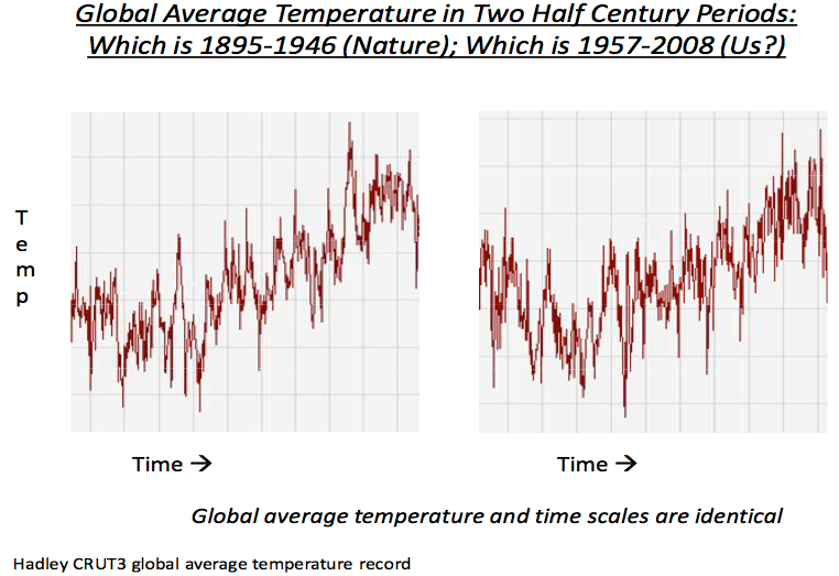
And sea-level rise? Do you really think the right-hand bits of the following graphs show “unprecedented” sea-level rise?
http://sealevel.info/Wismar_Honolulu_Oslo_Stockholm_vs_CO2_annot1.png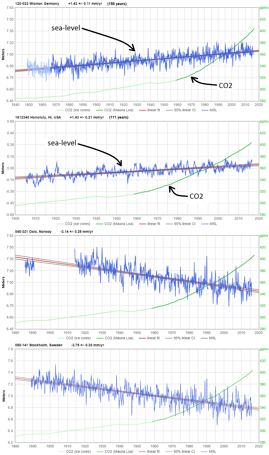
The first two graphs show typical trends from especially high-quality measurement records, on opposite sides of the Earth (12 time zones apart, during summer), at sites little affected by known distortions like tectonic instability, vertical land motion, and ENSO.
The last two graphs are from two sites which experience so much PGR that “sea-level rise” is negative, illustrating the fact that the global trend is so tiny that in many places it is insignificant, because it is dwarfed by common coastal processes, like vertical land motion, sedimentation, and erosion.
However, when I show climate alarmists graphs like those, they usually accuse me of cherry-picking. So here’s NOAA’s full 2016 list of 375 long term trend tide stations:
http://sealevel.info/MSL_global_thumbnails5.html
As you can see, none of the best-quality, long, sea-level measurement records show appreciable acceleration since the 1920s, or before.
izen continued, “…the egregious distortion of Hansen you attempt…”
I distorted nothing, and you surely know it. That sort of nastiness is destructive to scientific dialog. Please stop it.
My deleted ATTP comment 125333 (pdf screenshot)
Ken and Rachel, why did you delete my reply?
edimbukvarevic wrote, “Great comment daveburton!”
Thank you, you’re very kind. But Ken or Rachel apparently didn’t think so.
My deleted ATTP comment 125355 (pdf screenshot)
Really, Ken? Are you now deleting all my new comments, even my comment asking you why you deleted my comment?
Why are you doing this? Have I offended you somehow?
My deleted ATTP comment 125404 (pdf screenshot)
I linked to this ATTP discussion in the corresponding WUWT discussion, here:
https://wattsupwiththat.com/2018/06/28/why-the-climate-change-campaign-failed-scientists-demonstrate/#comment-2390138
In the spirit of reciprocity, this is the converse.
My mostly deleted ATTP comment 173037 (archived original version screenshot)
Unfortunately, many people who’re rightly skeptical of the “climate emergency” are also wrongly skeptical of this crisis, or at least they were, initially. That misplaced skepticism is one of the hidden costs of the “climate emergency” scam.
So-called “experts” have been crying “wolf” so long and loud about the fictitious “climate emergency” that many astute people, who’ve concluded that manmade climate change is actually modest and benign, have become dangerously accustomed to disregarding cries of “wolf!”
So when there’s a REAL catastrophe, and a different set of experts sound the alarm, some people wrongly assume it’s just another false alarm.
That’s a mistake which can have deadly consequences. In South Korea, one person, who they’re calling “Patient 31,” didn’t “believe in” the coronavirus emergency, and went on living her life as if she were not ill. Her irresponsibility has directly or indirectly caused the infection of about 2500 other people, so far.
Folks, this pandemic is not a false alarm. This is not another batch of superstitious paranoiacs, and scammers ginning up a fake “emergency” to pad their pockets. This one is real.
Be safe out there.
My deleted ATTP comment 173140 (pdf screenshot)
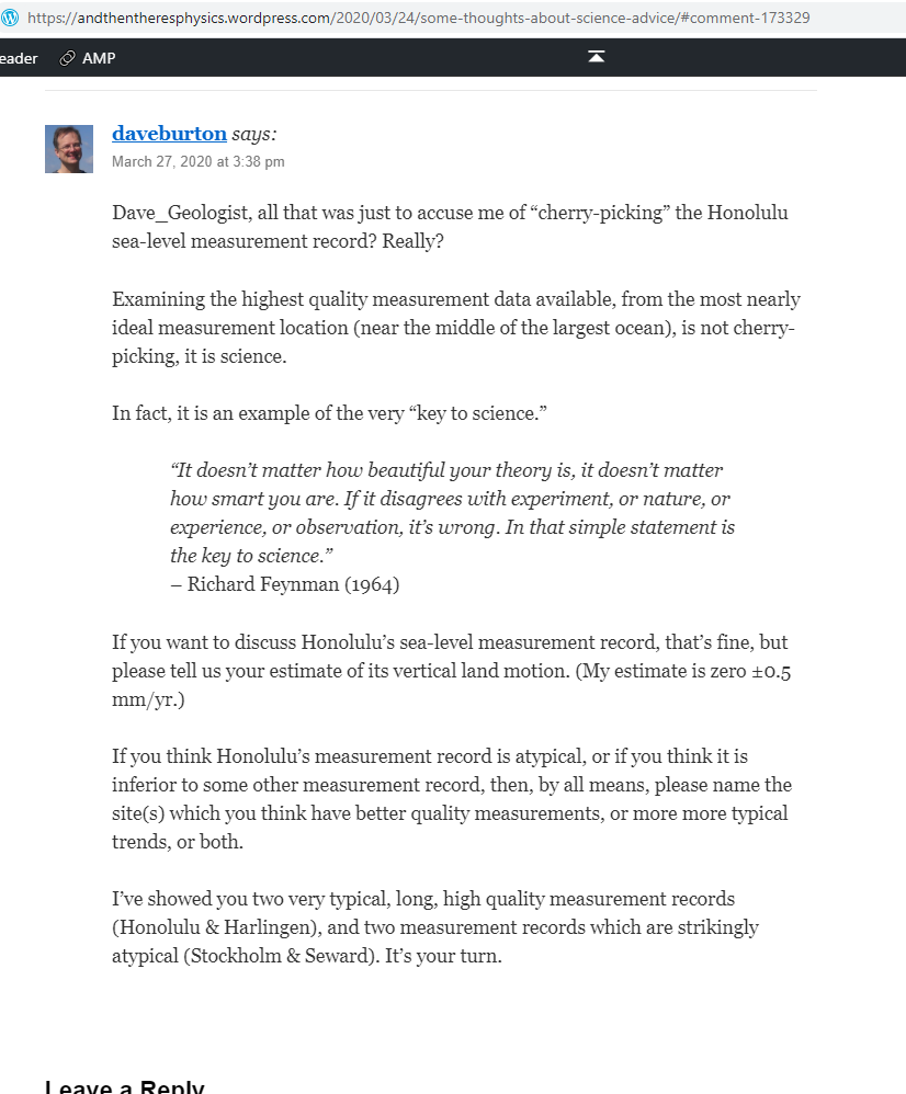
My deleted ATTP comment 173329 (pdf screenshot)
Dave_Geologist, all that was just to accuse me of “cherry-picking” the Honolulu sea-level measurement record? Really?
Examining the highest quality measurement data available, from the most nearly ideal measurement location (near the middle of the largest ocean), is not cherry-picking, it is science.
In fact, it is an example of the very “key to science.”
“It doesn’t matter how beautiful your theory is, it doesn’t matter how smart you are. If it disagrees with experiment, or nature, or experience, or observation, it’s wrong. In that simple statement is the key to science.”
– Richard Feynman (1964)
If you want to discuss Honolulu’s sea-level measurement record, that’s fine, but please tell us your estimate of its vertical land motion. (My estimate is zero ±0.5 mm/yr.)
If you think Honolulu’s measurement record is atypical, or if you think it is inferior to some other measurement record, then, by all means, please name the site(s) which you think have better quality measurements, or more more typical trends, or both.
I’ve showed you two very typical, long, high quality measurement records (Honolulu & Harlingen), and two measurement records which are strikingly atypical (Stockholm & Seward). It’s your turn.
My deleted ATTP comment 173351 (pdf screenshot)
My deleted ATTP comment 173351 (archived screenshot)
Will you acknowledge that when you say, “Most of those who complain about censorship, or being silenced/cancelled, seem to be those who say things that deserve to be criticised and simply don’t want to engage with their critics,” you’re not talking about me? That it is not me who doesn’t want to engage, when you delete my comments on ATTP?