A critique, by Dave Burton, of:
The Fingerprints of Sea Level Change
https://www.youtube.com/watch?v=RhdY-ZezK7w
by Jerry Mitrovica, Harvard University
Uploaded on May 18, 2011
Arthur M. Sackler Colloquia
The great bulk of scientific evidence indicates that anthropogenic CO2 is beneficial to both mankind and natural ecosystems, and the warming which results from it is modest and benign.
Atmospheric CO2 is the basic building block of plant life, from
which plants extract the carbon they need
 to grow. But at just 0.04% of the dry atmosphere, CO2 is in chronically short
supply. That's why commercial greenhouse operators customarily boost CO2
levels to about three times that level, because it dramatically improves plant growth.
Scientific American even called anthropogenic CO2 the
“precious air fertilizer,”
many years ago.
to grow. But at just 0.04% of the dry atmosphere, CO2 is in chronically short
supply. That's why commercial greenhouse operators customarily boost CO2
levels to about three times that level, because it dramatically improves plant growth.
Scientific American even called anthropogenic CO2 the
“precious air fertilizer,”
many years ago.
Fortunately, mankind's
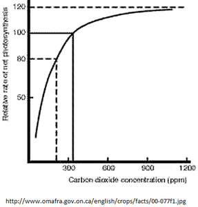
“anthropogenic” CO2 emissions have eased the CO2 shortage a bit. Over the last 70 years, we've
increased the average outdoor CO2 level from about 0.03% to 0.04%. The result has been a huge
increase in agricultural productivity. About 15-20% of current worldwide agricultural production
is now directly due to the “fertilization effect” of that additional CO2. Here's a graph (h/t
gov't of Ontario):
http://www.sealevel.info/CO2_vs_plant_growth_rate2.png
Here's
 a time-lapse video comparing plant growth (cowpea seedlings, in this case) under different CO2 levels:
https://youtu.be/P2qVNK6zFgE
As you can see, the benefits of additional CO2 are dramatic. Moreover, none of the hypothetical adverse effects of that additional CO2 actually seem to be happening.
Temperatures are nearly stable at “climate optimum” levels, similar to previous climate optimums.
Some scientists have speculated that anthropogenic CO2 could cause an increase in “extreme weather” events, but that hasn't happened, thus far. Since mankind has been driving CO2 levels up steadily for ~70 years, with no detectable increase in extreme weather, it is clear that CO2 doesn't significantly increase extreme weather frequency or severity.
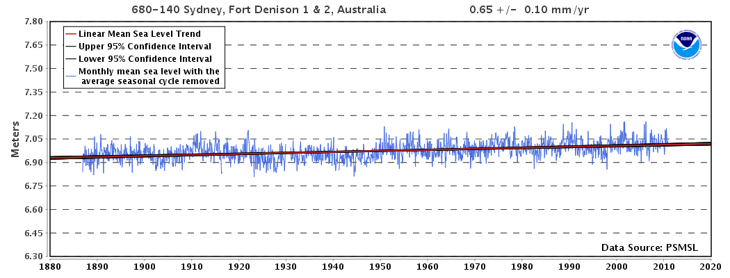
Accelerated sea-level rise is supposedly the worst of the adverse effects. On Al Gore's book cover, half of Florida is shown under water! But the truth is that, even though fossil fuel use has been driving up atmospheric CO2 levels for over 70 years, the rate of sea level rise hasn't increased at all. E.g., here's an excellent, long-term tide gauge record of Pacific sea-level:

http://www.sealevel.info/680-140_Sydney_2015-10.png
The scientific evidence for climate alarmism is so weak that even the Obama Administration has trouble finding reliable climate alarmists to promote The Cause. That should tell you something.
Dr. Steven Koonin was President Obama's Undersecretary for Science in the Energy Department during Obama's first term. He's a liberal, through-and-through, of course. But after he left that position, he finally felt at liberty to tell the inconvenient truth. He said:
“Even though the human influence on climate was much smaller in the past, the models do not account for the fact that the rate of global sea-level rise 70 years ago was as large as what we observe today.”
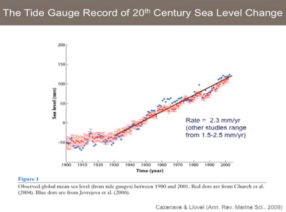
Jerry Mitrovica's “figure 1” slide shows that very clearly:

http://www.sealevel.info/Mitrovica_slr_slide_fig1_v3.jpg
The first thing you should notice in that slide is the most important thing that everyone should know about climate change and se-level: There's been no acceleration (increase in rate of sea-level rise) since before 1930 (85 years ago). The graph is essentially a straight line, from 1930 to present.
Since atmospheric GHG (mainly CO2) levels have been increasing substantially and steadily for roughly the last 70+ years, due mostly to fossil fuel use, the lack of acceleration in sea-level rise over that period means that anthropogenic GHG emissions have had no detectable effect on sea-level.
Dr. Mitrovica didn't get everything right, though. He shows the post-1930 average rate of sea-level rise as 2.3 mm/yr. That's way too high: ↑
The 1930-present global average rate of sea-level rise from the tide gauges which have recorded
sea-level over that time period is nowhere near 2.3 mm/year. Here's a spreadsheet which lists those
tide gauges:
(BTW, that web page is an exported Excel spreadsheet, which you can load
back into Excel, for easier analysis, if you wish.)
Scroll down to the bottom of the spreadsheet, and you'll see that the average of the measured rates of sea-level rise at those tide gauges is just 0.2 mm/year. (That's the column labeled "new trend.")
The average is skewed by the disproportionate number of northern gauges which are heavily affected by PGR. The median is more meaningful. But even the median of the measured rates of sea-level rise at those tide gauges is only 1.0 mm/year.
If you add Peltier's VM2 Post-Glacial Rebound (PGR) estimates, both average and median are still only 1.4 mm/year, not 2.3. (That's the rightmost column.)
79 of those 97 tide gauges have recorded sea-level rise rates of less than 2.3 mm/year. At 30 of those 97 locations, sea-level is falling, rather than rising. Just 18 of the 97 gauges have measured rates of sea-level rise of at least 2.3 mm/year.
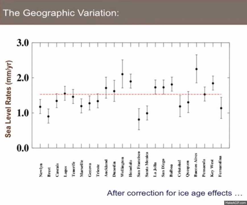
In fact, here's another slide from Dr. Mitrovica's same presentation. Based on the recommendation of Dr. Bruce Douglas, Dr. Mitrovica selected what they considered to be the 23 very best (“gold standard”) long-term tide gauges in the world, and plotted their rates of sea-level rise. Here's a spreadsheet and thumbnails of those 23 gauges, and here's the slide (to which I added the blinking blue “2.3” line): ↑
Look at the graph. Do you see it? All of the tide gauges he graphed showed rates of sea-level rise less than the supposed “average” of 2.3 mm/yr.
It's a funny sort of “average” which is larger than any of the actual data points!
In fact, the only location which he showed as being close to the supposed “average” of 2.3 mm/yr was Buenos Aires, at 2.25 mm/yr. But even that's not right. NOAA's data shows that sea-level there has really been rising at only 1.57 mm/yr. Over 40% of the supposed sea-level rise there is a product of model-based adjustments, not actual measurements.

As Dr. Mitrovica mentioned, and as you can clearly see, w/r/t rate of sea-level rise or fall, the best quality long-term GLOSS-LTT tide gauge records vary considerably. That's due mainly to varying rates of vertical land motion. At some locations, sea-level is falling, and at more locations it is rising. For locations with long, near-continuous records, the range is from about -8 mm/yr to about +7 mm/yr.
However, what Dr. Mitrovica failed to mention is that every high-quality, long-term GLOSS-LTT tide gauge record of sea-level shows the same thing w/r/t “acceleration” (change in rate of rise or fall). There's been no significant sustained acceleration in at least 85 years. All that anthropogenic CO2 has caused no increase in the rate of sea-level rise.
That's right: every high quality, long-term tide gauge shows that there's been no significant “acceleration” (increase in rate) over the last 85 years, regardless of whether sea-level is rising or falling at that particular location.
The lack of acceleration in sea-level rise over the period during which mankind has been driving up GHG levels means that anthropogenic GHG emissions (mainly CO2) have had no detectable effect on sea-level.
Jerry Mitrovica made a few other mistakes, as well.
He started out with three supposed arguments made by climate skeptics, but the first two were obvious red herrings. Nobody of consequence claims such things. They are “straw-men.”
Nobody I know of claims that sea-level has been rising steadily at 2 mm/year for thousands of years.
Nobody I know of claims that the fact that sea-level change varies dramatically from place to place means that sea-level rise isn't caused by meltwater from ice sheets.
Those are both silly nonsense. Nobody with any sense would say such things.
At 13:04 he made a more subtle mistake. Look at his slide there: he chose to analyze a small set of tide gauges with record lengths of at least 30 years. That's a blunder, because the research shows that at least 50-60 years of tide gauge data is needed to avoid the effects of multi-decadal cycles:
http://www.sealevel.info/papers.html#howlong
As physicist Nicola Scafetta has said:
"...an interval of just 30 years is the worst that can be chosen because it is half [of a] 60-year cycle"
At 13:45, there's what I would call an obfuscation, not an error. Dr. Mitrovica says that his graph is of sea-level rise rates in mm/year. But that's not really what it is. At the bottom of the slide you can read, "After correction for ice age effects."
What that means is that he did not graph actual, measured rates of sea-level rise. He added “corrections” to the measured rates. He probably used Prof. Richard Peltier's model-derived estimates of PGR effects, confirming the late John Daly's observation that:
"The impression has been conveyed to the world's public, media, and policy-makers, that the sea level rise of 18 cm in the past century is an observed quantity and therefore not open to much dispute. What is not widely known is that this quantity is largely the product of modeling, not observation, and thus very much open to dispute, especially as sea level data in many parts of the world fails to live up to the IPCC claims."
Finally, at 21:00 Dr. Mitrovica stopped bludgeoning straw-men. But then he made another, very basic error. He conflated satellite altimetry measurements of sea-level with tide-gauge measurements, and said that “in the last decade” the rate of sea-level rise “has already changed.” That's nonsense.
For one thing, apparent sea-level changes of a mere decade's duration are notoriously prone to being misleading (e.g., Kwajalein Atoll, in the Marshall Islands). But, more fundamentally, as you've seen, the rate of sea-level change varies considerably from one location to another. In addition to being much less trustworthy and than tide-gauge measurements, satellites can only measure sea-level in the open ocean, away from the shorelines. If you draw a graph which begins with measurements from one place, and ends with measurements from somewhere else, you can create the illusion of either acceleration or deceleration, depending on the locations you chose.
Neither tide gauges (over the last 85 years) nor satellites (as long as they've been operating) have measured acceleration in rate of sea-level rise. (Caveat: I don't trust the satellite altimetry data... and neither does NASA, which is why they're lobbying for a new space project called “GRASP,” to improve matters.)
It happens that most of the satellites have measured higher rates of sea-level rise than most tide-gauges:
http://www.sealevel.info/resources.html#aviso
So if you conflate satellite altimetry data with tide gauge data, you'll create the illusion
of acceleration in rate of sea-level rise, where none actually exists.
The IPCC made the same mistake; Tony Heller memorably called it the “IPCC Sea Level Nature Trick.”
Someone should have asked Dr. Mitrovica why, if he thinks sea-level rise has already accelerated, that acceleration hasn't affected the tide gauges?
It's because the supposed acceleration is an illusion.
At 22:50 he gets into fun but sillier stuff: what would happen if the great ice sheets melted entirely? I actually enjoyed that part of his lecture, and his analysis was intellectually interesting, but it has little to do with reality. The remaining great ice sheets cannot and will not melt entirely, within any timescale of interest to mankind.
At 24:20 he frets that the entire West Antarctic ice sheet is warming, implying that it could all melt. That's also silly. Warming doesn't necessarily mean melting. If ice warms, it will only melt if it reaches the melting point. Ice is equally stable at -10°C and -20°C. If you look closely at the color key on the bottom of his slide, the high-end of the warming it shows is just 0.25°C. There's no danger that the bulk of the West Antarctic Ice Sheet will melt, and certainly not as a result of a mere few-hundred-year-long anthropogenic pulse in CO2 levels.
P.S. — Dr. Mitrovica has another lecture on YouTube, on the same topic, here:
https://www.youtube.com/watch?v=qD3-XCJATTU
Comments on it are disabled.
Dr. Mitrovica has an even newer version here:
https://www.youtube.com/watch?v=s_rGksRoG9A
Comments on it are not disabled, but Google no longer permits substantive comments, with links to
references, which critique climate-related videos.
December 20, 2015 (with subsequent minor updates)
www.sealevel.info