Atmospheric Carbon Dioxide (CO2) and Methane (CH4) levels, 1800–present
Warning: javascript is disabled, so interactive features are unavailable.
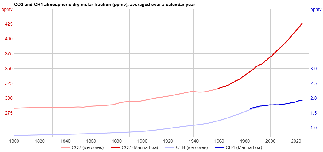
All CO2 and CH4 values are annual averages.
(or take a screenshot with PrtScn or the Windows Snipping Tool).
Note: We also have individual graphs of carbon dioxide (CO2) and methane (CH4) levels.
The relative scaling of the CO2 and CH4 axes was chosen so that the relative visual magnitude of changes in the two traces would very roughly approximate the relative warming effect of changes in the levels of the two gases. A 0.1 ppmv increase in atmospheric CH4 level has 40× to 50× as much warming effect (radiative forcing) as a 0.1 ppmv increase in atmospheric CO2 level. We used 50:1 so that the grid lines would line up nicely in the graph. ↑
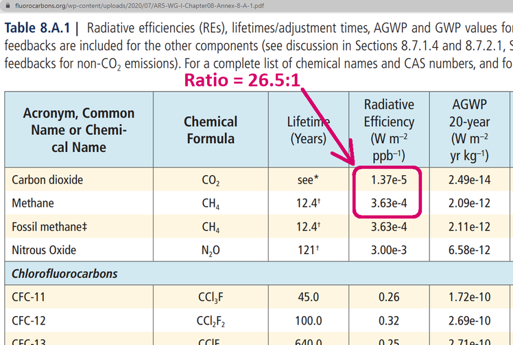
(Aside: in the literature you'll often see CH4 and CO2 compared by so-called “global warming potential” [GWP], which is an attempt to combine the effects of both the radiative forcing and lifetimes. That is irrelevant to this graph, which depicts atmospheric concentrations, not emissions. The effective atmospheric lifetime [“adjustment time”] of CH4 is only about 10-12 years, compared to about fifty years for CO2. So, while the immediate warming effect of added CH4 is 40× to 50× greater than the same amount of added CO2, the warming effect of added CH4 diminishes much more quickly over subsequent years. Here are some references to [mostly unrealistic!] GWP estimates and discussions: [1a&b],[2],[3],[4],[5],[6].)
Sources:
1958-present CO2 data is from https://gml.noaa.gov/webdata/ccgg/trends/co2/co2_annmean_mlo.txt.
For monthly data see
https://gml.noaa.gov/webdata/ccgg/trends/co2/co2_mm_mlo.txt
(measurements at Mauna Loa
SeaLevel.info
Last modified: 19-May-2026 (version 69)