Sealevel.info → AvgSLR → acceleration_primer
How to recognize “acceleration” in a graph
Do you know how to recognize “acceleration” in a graph, at a glance?
It is very simple. In a nutshell:
1. Concave-up. If the graph (with “time” or “age” represented by the horizontal “x-axis,” and “position” or “level” represented by the vertical “y-axis”) “curves upward” then it represents positive acceleration (regardless of whether the overall trend is upward or downward). Here are three examples:

2. Concave-down. If the graph (with “time” represented by the “x-axis”) “curves downward” then it represents deceleration, a/k/a “negative acceleration,” (regardless of whether the overall trend is upward or downward). Here are three examples:

3. Neither concave-up nor concave-down. If the graph shows a straight line, then it is said to be “linear.” That means there is no acceleration, or “acceleration is zero.” Here are three examples:

If that is unclear, Google will find some videos which explain it:
Example
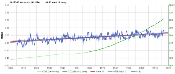
Now look, for example, at this 111-year record of sea-level at Honolulu, juxtaposed with carbon dioxide (CO2):

(Click on the graph for an interactive version, in which you can hover your mouse cursor over the traces to see the values.)
The green trace is CO2. Do you see that CO2 rise accelerated, quite dramatically, after WWII?
The blue trace is sea-level. Of course it is sloshing up and down a bit, over periods of a decade or two, but do you see that there has been no sustained acceleration in response to the rise in CO2 levels? Although CO2 level has accelerated, sea-level rise has remained linear.
(That's what the sea-level measurement data shows in most places, BTW.)
SeaLevel.info